HARBINGER: THE BEGINNING - Recolored Pages - SNEAK PREVIEW
Moderators: Daniel Jackson, greg
-
greg

- The admin around here must be getting old and soft.

- Posts: 22887
- Joined: Wed Feb 04, 2004 9:39 am
- Valiant fan since: Rai #0
- Favorite character: Depends on title
- Favorite title: Depends on writer
- Favorite writer: Depends on artist
- Favorite artist: Depends on character
- Location: Indoors
- Contact:
HARBINGER: THE BEGINNING - Recolored Pages - SNEAK PREVIEW
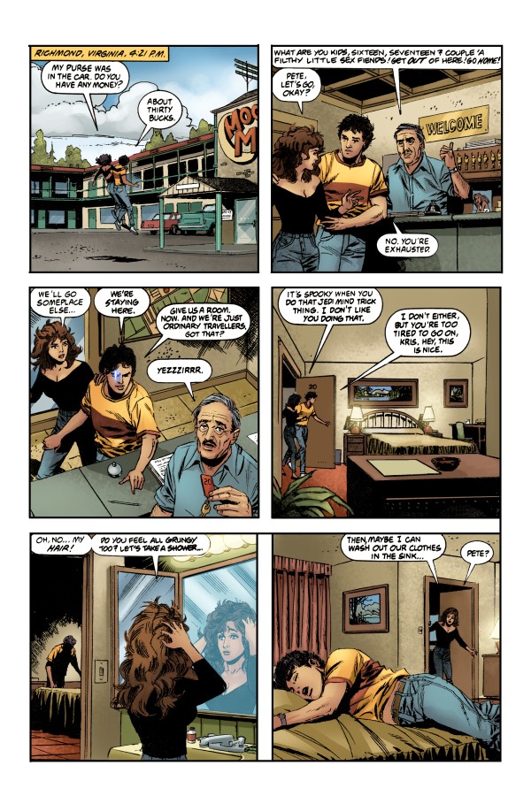
Valiant Entertainment is proud to present a sneak preview of recolored pages for the upcoming HARBINGER: THE BEGINNING hardcover to ValiantFans.com first! All digital recoloring was overseen by original Valiant colorists who had an insider's view on the original intention of Harbinger's creative team. The integrity of the original look was preserved, while adding depth, special effects, and corrections using the latest digital techniques. The melding of classic storytelling and modern execution more accurately showcases the original vision for Harbinger issues #0 - #7 than ever before.
HARBINGER: THE BEGINNING (JUN073932), published by Valiant Entertainment, is solicited in the June Previews (Volume XVII #6) and scheduled to arrive in comic book stores nationwide on August 29th, 2007. The book marks the milestone return of comics legend Jim Shooter and is a full-color 192 page hardcover with a suggested retail price of $24.95.
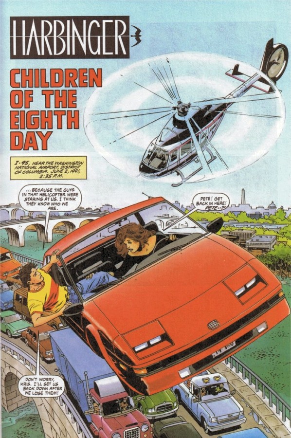
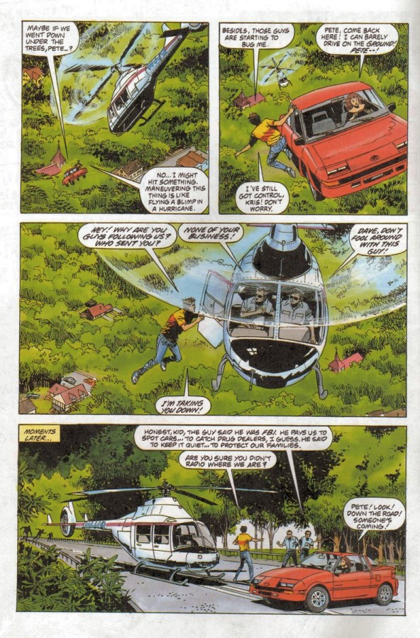
Harbinger #1 - Page One

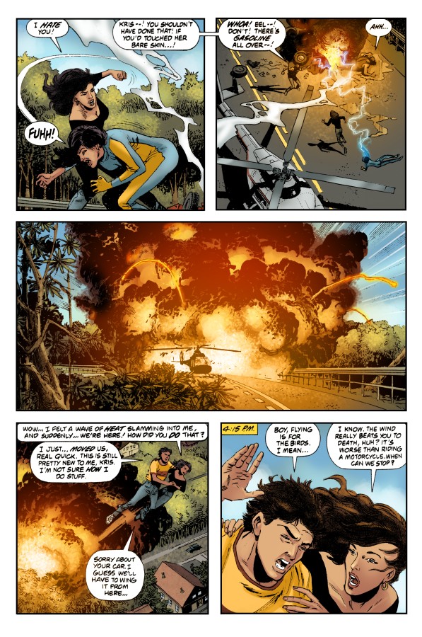
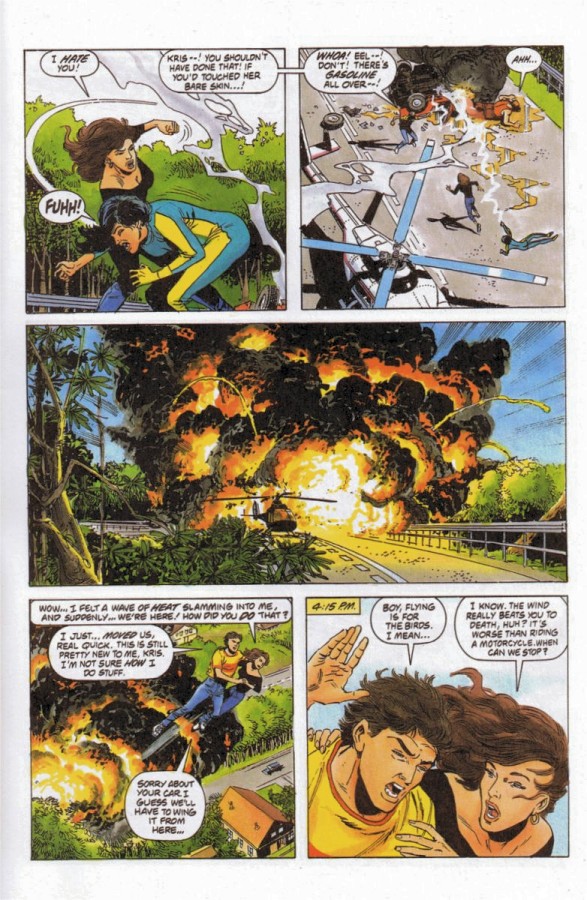
Harbinger #1 - Page Five
----------------------------------------------------------------
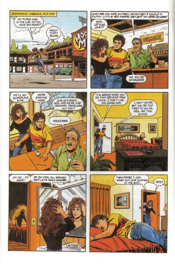
Edit, June 19, 2007: Additional pages posted at Broken Frontier:
http://www.brokenfrontier.com/headlines ... hp?id=2981
Harbinger #1 - Page One
Harbinger #1 - Page Two
Harbinger #1 - Page Three
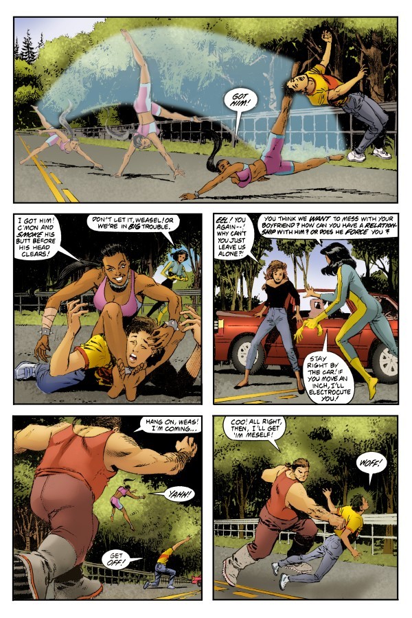

Harbinger #1 - Page Four
Harbinger #1 - Page Five
Harbinger #1 - Page Six
HARBINGER: THE BEGINNING (JUN073932), published by Valiant Entertainment, is solicited in the June Previews (Volume XVII #6) and scheduled to arrive in comic book stores nationwide on August 29th, 2007. The book marks the milestone return of comics legend Jim Shooter and is a full-color 192 page hardcover with a suggested retail price of $24.95.
Harbinger #1 - Page One
Harbinger #1 - Page Five
----------------------------------------------------------------
Edit, June 19, 2007: Additional pages posted at Broken Frontier:
http://www.brokenfrontier.com/headlines ... hp?id=2981
Harbinger #1 - Page One
Harbinger #1 - Page Two
Harbinger #1 - Page Three
Harbinger #1 - Page Four
Harbinger #1 - Page Five
Harbinger #1 - Page Six
Last edited by greg on Thu Jun 21, 2007 1:42 pm, edited 2 times in total.
-
Lightning Strike

- Silent from '04 to '07, then he strikes!

- Posts: 8008
- Joined: Mon Apr 12, 2004 9:58 pm
- Location: Physically: USA---Spiritually: Ireland
Re: HARBINGER: THE BEGINNING - Recolored Pages - SNEAK PREVI
I have to say, the recoloring really makes the book look drastically different. The pages are crisper and more defined.
I can't wait to get my copy and compare the whole thing to the originals, and most especially that new story.
BTW Greg, are you still offering valiantfans.com space for $10 a year?
I can't wait to get my copy and compare the whole thing to the originals, and most especially that new story.
BTW Greg, are you still offering valiantfans.com space for $10 a year?
-
Heath

- The Saints will win the Super-Bowl!
- Posts: 11527
- Joined: Thu Dec 30, 2004 7:05 pm
- Valiant fan since: 1992
- Favorite character: VH1 Shadowman; VEI X-O
- Favorite title: VH1 Shadowman; VEI X-O, Harb
- Favorite writer: Bob Hall; Dysart, Van Lente
- Location: Torque's Hundred-Yard-Long New Orleans Saints' Themed Dining Hall
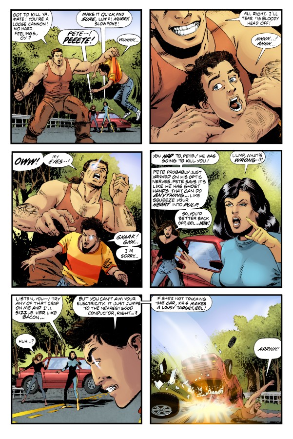
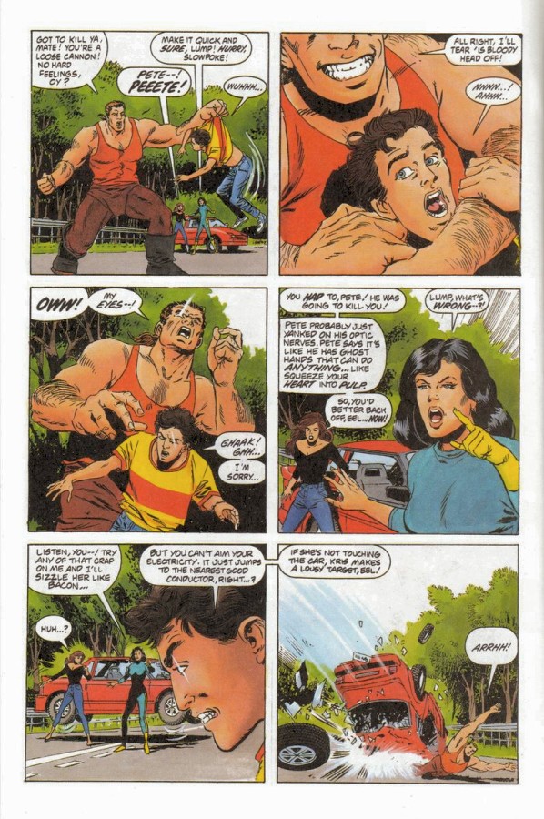
Thanks, Greg and Dino! Great job on the computer coloring. I think it's some of the best computer coloring I've seen. It looks like great care was taken to stick with the original look and feel, but add a bit more flair to it too. I definitely like the recolored page 1 better than the original, but I think I like the original version of page 5 a little better - especially the explosion. The upper right panel is the only panel on that page that looks a lot better.
There was just something about that original water color by hand technique that I have always loved and so closely associated with Valiant.
Last edited by Heath on Thu Jun 14, 2007 7:23 pm, edited 1 time in total.
-
dellamorte

- Zombies and nightstand nightmares
- Posts: 6544
- Joined: Wed Feb 04, 2004 8:28 pm
- Location: down down down to mephisto's cafe
For the most part I like it but it seems to take a little something away from the look. I love the old hand painted Valiant colors. I understand the change and it appears to be done well.
Oh and just a note for the editor, you might want to change up the colors on the cars just a bit. That's a lot of red and white.
Oh and just a note for the editor, you might want to change up the colors on the cars just a bit. That's a lot of red and white.


-
Lightning Strike
- Silent from '04 to '07, then he strikes!
- Posts: 8008
- Joined: Mon Apr 12, 2004 9:58 pm
- Location: Physically: USA---Spiritually: Ireland
I think that was done intentionally to draw your attention away from the background and to the main characters.dellamorte wrote:For the most part I like it but it seems to take a little something away from the look. I love the old hand painted Valiant colors. I understand the change and it appears to be done well.
Oh and just a note for the editor, you might want to change up the colors on the cars just a bit. That's a lot of red and white.


-
ManofTheAtom
- Deathmate was cool
- Posts: 13475
- Joined: Wed Feb 04, 2004 5:19 pm
- Location: Mexico City
- Contact:
I like the red car, it gives it a 3D "VALIANT Vision"esque effect that makes it pop out of the page, like it's flying out of it straight to you.dellamorte wrote:For the most part I like it but it seems to take a little something away from the look. I love the old hand painted Valiant colors. I understand the change and it appears to be done well.
Oh and just a note for the editor, you might want to change up the colors on the cars just a bit. That's a lot of red and white.
-
dellamorte
- Zombies and nightstand nightmares
- Posts: 6544
- Joined: Wed Feb 04, 2004 8:28 pm
- Location: down down down to mephisto's cafe
Not the red car center page but all the red cars on the road down below.ManofTheAtom wrote:I like the red car, it gives it a 3D "VALIANT Vision"esque effect that makes it pop out of the page, like it's flying out of it straight to you.dellamorte wrote:For the most part I like it but it seems to take a little something away from the look. I love the old hand painted Valiant colors. I understand the change and it appears to be done well.
Oh and just a note for the editor, you might want to change up the colors on the cars just a bit. That's a lot of red and white.
-
greg
- The admin around here must be getting old and soft.
- Posts: 22887
- Joined: Wed Feb 04, 2004 9:39 am
- Valiant fan since: Rai #0
- Favorite character: Depends on title
- Favorite title: Depends on writer
- Favorite writer: Depends on artist
- Favorite artist: Depends on character
- Location: Indoors
- Contact:
They're not all red... the Sweet Pickles Bus is in there.dellamorte wrote:Not the red car center page but all the red cars on the road down below.ManofTheAtom wrote:I like the red car, it gives it a 3D "VALIANT Vision"esque effect that makes it pop out of the page, like it's flying out of it straight to you.dellamorte wrote:For the most part I like it but it seems to take a little something away from the look. I love the old hand painted Valiant colors. I understand the change and it appears to be done well.
Oh and just a note for the editor, you might want to change up the colors on the cars just a bit. That's a lot of red and white.
-
ManofTheAtom
- Deathmate was cool
- Posts: 13475
- Joined: Wed Feb 04, 2004 5:19 pm
- Location: Mexico City
- Contact:
-
whovianone

- ...it hurts so much ...my brain hurts!
- Posts: 3240
- Joined: Fri Feb 02, 2007 10:15 am
- Location: Kettering, OH
-
Todd Luck

- Doomed to forever roam the black halls
- Posts: 4729
- Joined: Fri Jun 04, 2004 1:02 pm
- Location: Winston-Salem, NC
Wow, I knew I missed the old coloring on the Valiant books but I never realized how much. Part of the fun of the first couple years of Valiant were the orginal colors. I know there's some technical reason they can't use the originals here (even though some of those issues were reprinted in the 90's) but I wish they'd tried to make it look closer to the old comic. The modern McColoring I see on every comic out there now put on those classic comics makes me cringe. It just doesn't work for me. I'm glad I already decided to sit this one out.
-
greg
- The admin around here must be getting old and soft.
- Posts: 22887
- Joined: Wed Feb 04, 2004 9:39 am
- Valiant fan since: Rai #0
- Favorite character: Depends on title
- Favorite title: Depends on writer
- Favorite writer: Depends on artist
- Favorite artist: Depends on character
- Location: Indoors
- Contact:
Your loss... personally, I like a blue sky.Todd Luck wrote:Wow, I knew I missed the old coloring on the Valiant books but I never realized how much. Part of the fun of the first couple years of Valiant were the orginal colors. I know there's some technical reason they can't use the originals here (even though some of those issues were reprinted in the 90's) but I wish they'd tried to make it look closer to the old comic. The modern McColoring I see on every comic out there now put on those classic comics makes me cringe. It just doesn't work for me. I'm glad I already decided to sit this one out.

I agree.Heath wrote:
Thanks, Greg and Dino! Great job on the computer coloring. I think it's some of the best computer coloring I've seen. It looks like great care was taken to stick with the original look and feel, but add a bit more flair to it too. I definitely like the recolored page 1 better than the original, but I think I like the original version of page 5 a little better - especially the explosion. The upper right panel is the only panel on that page that looks a lot better.
There was just something about that original water color by hand technique that I have always loved and so closely associated with Valiant.
/Magnus
-
betterthanezra
- Wanna see an unpublished Shadowman page?
- Posts: 12346
- Joined: Mon Feb 09, 2004 12:18 am
- Valiant fan since: 1991
- Favorite writer: Josh Dysart
- Location: Scoot over, I have to get in behind you.
-
muzzsucker

- Cruisin' in Darpan's Winnebago

- Posts: 667
- Joined: Wed Sep 29, 2004 12:55 am
- Location: gobble gobble

-
TKWill

- Don't squeeze the Deathmate!
- Posts: 4644
- Joined: Mon Apr 16, 2007 12:42 am
- Location: Richardson, TX
Since I have had a little time to settle dwon after seeing this I look at it with mixed feelings. I am going to miss the watercolor style that VALIANT is known for, like it has been mentioned on many threads including this one, it was a small part of what got me to read VALIANT all those years ago and in some way part of what brought me back. The other part of me is okay with seeing it go. While it is hard for me to say that, there is more of a market for this book with eye-popping color and sharp detail. It is simply what a great deal of the market demands. IMO this change is what is part of what will be needed to bring new readers in to our little corner of the "Dead Universe" which is something that VALIANT will need in those crucial first months. I personally like the change, I have grown accustomed to newer books having this feel, and I welcome the change with open arms.