Miscut or Miswraped Harbinger #1
Moderators: Daniel Jackson, greg
-
drmirage
- WOW! OMG BBQ! Thats crazy!

- Posts: 3152
- Joined: Mon Feb 09, 2004 12:40 am
- Valiant fan since: 1990
- Favorite title: Archer & Armstrong
- Favorite writer: BWS
- Location: Los Angeles
Miscut or Miswraped Harbinger #1
I've been wanting to post these up. I wanted to ask if if these are common.
Is the 2nd photo Miscut or Miswraped? (Look carefully at the bottom right word bubble)
Regular Harbinger #1

Miscut / Miswraped Harbinger #1

Is the 2nd photo Miscut or Miswraped? (Look carefully at the bottom right word bubble)
Regular Harbinger #1
Miscut / Miswraped Harbinger #1
-
Man Of The Atom

- Is it Dee-no or Die-no? Dunno.

- Posts: 420
- Joined: Fri May 11, 2012 3:41 am
- Favorite artist: Ramon Villalobos
- Location: San Francisco
Re: Miscut or Miswraped Harbinger #1
Are the two books the exact same size?
-
drmirage
- WOW! OMG BBQ! Thats crazy!
- Posts: 3152
- Joined: Mon Feb 09, 2004 12:40 am
- Valiant fan since: 1990
- Favorite title: Archer & Armstrong
- Favorite writer: BWS
- Location: Los Angeles
Re: Miscut or Miswraped Harbinger #1
Yes. The books are exactly the same size. I will scan the books later again. The second book is a few deg of going clockwise.
-
Paladon

- If you gave Aric hugs and kisses, would it be XOXO X-O?

- Posts: 28
- Joined: Mon Mar 12, 2012 7:26 pm
Re: Miscut or Miswraped Harbinger #1
If you look at the bubbles close to the Harbinger logo they are in the same place. Does this mean that one of them has the image slightly zoomed in? Does this mean an alternate print as the printer would have one master to work from for each print run?
-
Man Of The Atom
- Is it Dee-no or Die-no? Dunno.
- Posts: 420
- Joined: Fri May 11, 2012 3:41 am
- Favorite artist: Ramon Villalobos
- Location: San Francisco
Re: Miscut or Miswraped Harbinger #1
The "miss-cut" one also has more space between the names of the creators and the top of the book, which makes it seem like the books are cut from a bigger picture.
If you count the windows of the building above the 'R' in Dysart there is only one in the normal book, but you can count one plus part of a second in the "miss-cut" book.
It seems like it was cut slightly different to me, but I don't know how comics are printed. Maybe the picture was just zoomed in a little more when it was being printed.
There is probably already a thread on it, but does anybody know anything about the printing process that would cause this?
-
greg

- The admin around here must be getting old and soft.

- Posts: 22884
- Joined: Wed Feb 04, 2004 9:39 am
- Valiant fan since: Rai #0
- Favorite character: Depends on title
- Favorite title: Depends on writer
- Favorite writer: Depends on artist
- Favorite artist: Depends on character
- Location: Indoors
- Contact:
Re: Miscut or Miswraped Harbinger #1
The images for the covers are much larger than they are cut.
As a result, the image allows for the cut to be off by a little in any direction, but still have a cover that's presentable.
The most "famous" (in Valiant) example is Rai #3 (1992).
Most copies are cut so that there is no cover image showing above the red Rai title box.
Fewer copies show the blue and orange of the cover image (dragon) above the Rai title.
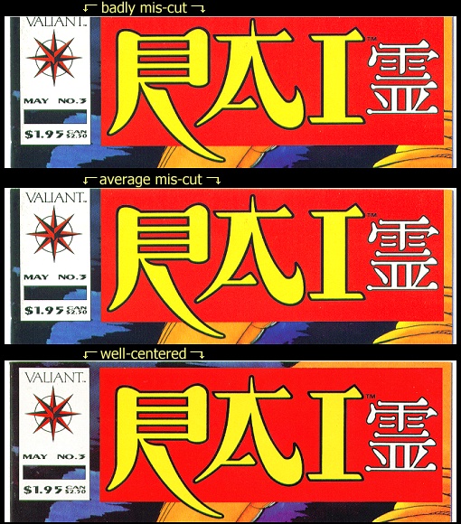
It is likely that examples of this cutting variability could be found for every comic book.
As far as I know, it only matters (as far as market value) if it makes a difference in the "presentation" of the book.
In some cases (like Rai #3), more value is reflected in well-centered copies.
In other cases, a badly miscut book is an unusual novelty and may have more value than a more common (well-centered) version.
As a result, the image allows for the cut to be off by a little in any direction, but still have a cover that's presentable.
The most "famous" (in Valiant) example is Rai #3 (1992).
Most copies are cut so that there is no cover image showing above the red Rai title box.
Fewer copies show the blue and orange of the cover image (dragon) above the Rai title.
It is likely that examples of this cutting variability could be found for every comic book.
As far as I know, it only matters (as far as market value) if it makes a difference in the "presentation" of the book.
In some cases (like Rai #3), more value is reflected in well-centered copies.
In other cases, a badly miscut book is an unusual novelty and may have more value than a more common (well-centered) version.