What about the Strict Shooter Page layouts for new launch?
Moderators: Daniel Jackson, greg
-
MoonChild

- I HAVE NO INTENT ON BEING PATIENT!

- Posts: 4351
- Joined: Wed Sep 26, 2007 1:14 am
- Valiant fan since: 1992
- Favorite character: BloodShot
- Favorite title: Harbinger
- Favorite writer: Dysart
What about the Strict Shooter Page layouts for new launch?
What do you guys think about this? I like his conformity to an extent but I also like when an artist is allowed to be creative and break the rules sometimes. We should ask VEI about this. I'd imagine they are not going to be to strict on it.
-
Burrito Boy
- Just jumpin' through time arcs, that's all.
- Posts: 1654
- Joined: Fri Jan 09, 2009 10:56 pm
- Favorite character: Gunny Lewis
- Favorite title: Armorines
- Favorite writer: Jorge Gonzalez
- Location: Cimmeria
- Contact:
-
Daniel Jackson

- A toast to the return of Valiant!
- Posts: 38007
- Joined: Mon Jun 21, 2004 8:33 pm
-
400yrs

- Am I Too Old to be Licking This?
- Posts: 11484
- Joined: Wed Nov 24, 2004 11:55 am
- Valiant fan since: A&A #0
- Favorite character: Shadowman
- Favorite title: Harbinger
- Favorite writer: Dysart
- Favorite artist: Lapham
- Location: #champabay
If they want this line to have a shot at succeeding, the books need to have a modern look to them. Sticking to the Jim Shooter method of 5-6 panels per page with all the action in the panel is a recipe for disaster. If you need an example, look at the DK line. It ain't the 60s no more. It's not even the 90s.
X2400yrs wrote:If they want this line to have a shot at succeeding, the books need to have a modern look to them. Sticking to the Jim Shooter method of 5-6 panels per page with all the action in the panel is a recipe for disaster. If you need an example, look at the DK line. It ain't the 60s no more. It's not even the 90s.
-
ian_house

- using a Welsh to American translator
- Posts: 5783
- Joined: Tue Apr 11, 2006 8:24 am
- Location: Vietnam
Agreed. We got a classic design for DK and it didnt work.sanman wrote:X2400yrs wrote:If they want this line to have a shot at succeeding, the books need to have a modern look to them. Sticking to the Jim Shooter method of 5-6 panels per page with all the action in the panel is a recipe for disaster. If you need an example, look at the DK line. It ain't the 60s no more. It's not even the 90s.
-
wrunow
- Where are you now?
- Posts: 3658
- Joined: Mon Feb 23, 2004 10:10 am
- Valiant fan since: 1991
- Favorite character: They killed her off!
- Favorite title: Harbinger
- Favorite writer: Dysart
- Favorite artist: Nord
- Location: York, Maine
I agree with this statement, but, maybe some of the modern art concepts could be used only for certain occasions or under strict guidelines so the art doesn't get totally out of control. I think VALIANT was about reading stories first and the pictures were a guide. I'm all for making the pictures more entertaining, let's just make sure the stories are exemplary.400yrs wrote:If they want this line to have a shot at succeeding, the books need to have a modern look to them. ticking to the Jim Shooter method of 5-6 panels per page with all the action in the panel is a recipe for disaster. If you need an example, look at the DK line. It ain't the 60s no more. It's not even the 90s.
This is why I like that they went with Warren Simons and someone with a strong writing/editing background.
-
Heath

- The Saints will win the Super-Bowl!
- Posts: 11527
- Joined: Thu Dec 30, 2004 7:05 pm
- Valiant fan since: 1992
- Favorite character: VH1 Shadowman; VEI X-O
- Favorite title: VH1 Shadowman; VEI X-O, Harb
- Favorite writer: Bob Hall; Dysart, Van Lente
- Location: Torque's Hundred-Yard-Long New Orleans Saints' Themed Dining Hall
I think they have to find a nice balance. I like the old Valiant "house style" of art and layout. I think that enables (or even forces) better storytelling. But, I also don't mind a more modern approach when the situation calls for it.
I think the panel layouts on the Brubaker Captain America run (which I'm now getting caught up on - I'm up to Reborn #5 now) have that perfect balance.
I think the panel layouts on the Brubaker Captain America run (which I'm now getting caught up on - I'm up to Reborn #5 now) have that perfect balance.
-
Triumphant Serial Number
- 100 posts! (if you round to the nearest 100)
")
- Posts: 53
- Joined: Thu Mar 17, 2011 9:18 pm
good storytelling is good storytelling. If old-fashioned traditional panels are what it takes to tell the story, then that's what it takes.
As an example, I believe I've seen on here accusations that Shooter railroaded BWS into stifling grids and hamstrung a master storyteller like BWS.
But I just looked through issue #1 of BWS Storyteller. It might be from 15 years ago but it's all BWS written and illustrated under his full ownership and control. No Shooter around with his shackles and straitjacket.
And it's full of grids! And panels! And I only found one instance of panel breaking, a small bit of a hand popping through. Other than that, it was a Shooter dream come true: 6 panel grids, 4 panel grids, 9 panel grids . . . grids grids everywhere!
But storytelling like that probably doesn't have a place anymore. Traditional style like Shooter likes are best for the old belief that "every comic is somebody's first comic", which is good for all newcomers but especially children to be able to understand the story fully and get them coming back for more.
But let's not kid ourselves. Nobody is having their first comic anymore. There are no new readers, the industry is already dead and just peeling off the remaining buyers as they die or leave comics behind. Children don't read comics, never even come across comics. And even if they did, Valiant would be too mature for them, just as the new DH GK books were certainly too adult for children.
So bring on the decompressed exploded nonsense. Comics don't matter anymore, they're just vehicles for film-tv-games if they're lucky.
-
orbitalshift
- Get those scissors away from my coupons

- Posts: 321
- Joined: Tue Mar 02, 2010 9:08 pm
- Location: North Carolina
I like the "Valiant" style. I think simplicity in the layout makes the story easier to follow and more compelling. I like the occasional broken rule for emphasis. When every page has some stylized junk on it, the whole becomes lessened. Some artists take the traditional approach and enhance it. Far to many just break the story for the sake of style. I think many artists today are more interested in selling the art pages than telling a story.
-
jbtheo

- My posts can all fit in a short box
- Posts: 187
- Joined: Thu Feb 14, 2008 3:56 pm
- Location: Walnut Creek, CA
Valiant back in the day was successful because of story, regardless of how "bad" the art was. They hired a lot of new Kubert school graduates because they were cheap labor, so, I assume, didn't pay them very much. So, it wasn't the art. The art got the job done, but I wouldn't call it "eye candy". But for some reason it did well. To this day, I still wonder how that happened. I think a lot of it had to do with prospectors and collectors. I know the stories are great and most of you hear agree, but really, how did it end up doing so well, especially during the time of McFarlane/Lee/Liefeld? Not many buyers cared about story as much back then. Hell, I couldn't have cared less about story. I just loved the art. But, then again, I was 14 years old. Maybe adults got wind of Valiant, because those are the only ones that could appreciate good stories??
With the new Valiant, I imagine, will only be hiring top tier to mid-range experienced talent. No new talent. They can't really afford to enter the comic publishing arena with fresh talent (in my opinion). If they do, great, but I've a feeling, since they are hiring some big comic exectutives, the artists and writers will be equally impressive.
I was considering doing some art samples for Valiant, but I decided against it, because I think I would be wasting my time. I think they would rather hire well-knowns rather than new guys. I am literally just starting out in professional comics (I got my first gig with a new startup, with investors and all), and I feel after I have a few years of steady comics under my belt, I can finally start to express interest in Marvel/DC/Valiant (I hope they are still around in 2014 or 2015).
If I'm wrong, I'd love to know. I'm not being all gloom and doom, but if I was going head-to-head with Marvel/DC and hiring these big exec names, I'd only go after well known artists/writers, too.
So, to answer the topic question, I think the art is going to lean toward modern sequential storytelling, which is definitely not the standard 6-up grid.
-
jbtheo
- My posts can all fit in a short box
- Posts: 187
- Joined: Thu Feb 14, 2008 3:56 pm
- Location: Walnut Creek, CA
I also think comic storytelling has lost it's way of late in mainstream comics. The uber-details are unimportant. Just tell the story. I am a student of the Jim Shooter school of thought.
I also hope each issue of the new VEI doesn't take me only 5 minutes to read. I also hope they stay away from double-page spreads with a single caption on it somewhere in the top left corner.
I also hope each issue of the new VEI doesn't take me only 5 minutes to read. I also hope they stay away from double-page spreads with a single caption on it somewhere in the top left corner.
-
Daniel Jackson
- A toast to the return of Valiant!
- Posts: 38007
- Joined: Mon Jun 21, 2004 8:33 pm
Believe it or not, where I felt Valiant lacked in page design, the coloring and the higher quality white paper drew me in. Keep in mind that in the early ‘90s I was mostly reading DC and Marvel which was printed on very thin news print and colored with blocks of bright colors.jbtheo wrote:Valiant back in the day was successful because of story, regardless of how "bad" the art was. They hired a lot of new Kubert school graduates because they were cheap labor, so, I assume, didn't pay them very much. So, it wasn't the art. The art got the job done, but I wouldn't call it "eye candy". But for some reason it did well. To this day, I still wonder how that happened. I think a lot of it had to do with prospectors and collectors. I know the stories are great and most of you hear agree, but really, how did it end up doing so well, especially during the time of McFarlane/Lee/Liefeld? Not many buyers cared about story as much back then. Hell, I couldn't have cared less about story. I just loved the art. But, then again, I was 14 years old. Maybe adults got wind of Valiant, because those are the only ones that could appreciate good stories??
With the new Valiant, I imagine, will only be hiring top tier to mid-range experienced talent. No new talent. They can't really afford to enter the comic publishing arena with fresh talent (in my opinion). If they do, great, but I've a feeling, since they are hiring some big comic exectutives, the artists and writers will be equally impressive.
I was considering doing some art samples for Valiant, but I decided against it, because I think I would be wasting my time. I think they would rather hire well-knowns rather than new guys. I am literally just starting out in professional comics (I got my first gig with a new startup, with investors and all), and I feel after I have a few years of steady comics under my belt, I can finally start to express interest in Marvel/DC/Valiant (I hope they are still around in 2014 or 2015).
If I'm wrong, I'd love to know. I'm not being all gloom and doom, but if I was going head-to-head with Marvel/DC and hiring these big exec names, I'd only go after well known artists/writers, too.
So, to answer the topic question, I think the art is going to lean toward modern sequential storytelling, which is definitely not the standard 6-up grid.
It’s when one compares the recolored hard covers and the Dark Key books with comics illustrated by guys like Ethan Van Sciver and J.H. Williams that you realize page layout is important in telling the narrative. Denying this hampers the full potential of sequential art and crushes creative collaboration.
In the below examples the dynamic illustrations and page designs help move the story along:
Ethan Van sciver

J.H. Williams

Ethan Van sciver
J.H. Williams
Last edited by sanman on Sat Jun 11, 2011 12:52 pm, edited 1 time in total.
You gave JH Williams the props that he deserves. But perhaps comparing his art to any other illustrator’s work (regardless of the decade) is a high bar to reach—perhaps I’m being unfair.
Regardless, you mention Valiant original art with special praise for their covers. I couldn’t agree more, but many of my favorite dynamic Pre-Unity covers were drawn by BWS who I’d argue got his wings clipped for the sake of Shooter’s house mandates.
Just compare these two pages. Of the two, which tells a more compelling story visually?
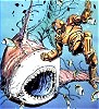
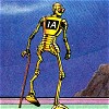
Archer & Armstrong #8, 1993

Rune #4, 1994

Regardless, you mention Valiant original art with special praise for their covers. I couldn’t agree more, but many of my favorite dynamic Pre-Unity covers were drawn by BWS who I’d argue got his wings clipped for the sake of Shooter’s house mandates.
Just compare these two pages. Of the two, which tells a more compelling story visually?
Archer & Armstrong #8, 1993
Rune #4, 1994
-
Ryan

- I would buy anything about these characters, sadly.
- Posts: 3482
- Joined: Sun Feb 08, 2004 9:51 pm
I'm a fan of grid layouts. One of the reasons Watchmen is so accessible is the strict 9 panel grids. Great crime comics like Stray Bullets, Criminal, etc etc use strict grids without seeming 'dated'. It's all about the execution.
That being said, IMO I don't think having a strict, company-wide mandate about page layouts is the way to go. I think you hire talented, experienced creators and editors and let them tell their stories in the best way they know how.
PS I'm not really a fan of the wild page layouts shown in this thread. Sure they look nice when you flip through, but does it do anything for the reading experience except distract you from the story?
I suppose one could argue the topic from different sides. I collect Silver Age and Bronze Age comics so I can appreciate any page composition. However, my argument is two fold.
First, the writer shouldn’t be afraid of the composition—it is sequential art after all and the best sequence should be chosen to tell the given story.
Second, some of today’s art might be overpowering—even some of JH Williams pages are probably too self-indulgent. But to adapt a rigid house style is only going to create books that are dated looking or ones that put style over substance.
Hence, I believe greater emphasis should be put on matching the right style and composition with the stories and characters rather than adopting a blanket house style. For example X-O is not Showman and future artists should be free to tell the most compelling stories with both words and illustrations. But additionally, Valiant should understand what today’s audience is expecting both in terms of art and writing and strive to publish books that will be relevant for the modern audience.
-
Triumphant Serial Number
- 100 posts! (if you round to the nearest 100)
- Posts: 53
- Joined: Thu Mar 17, 2011 9:18 pm
I'm not seeing what's so revolutionary about the Van Sciver page . . . is it just a double page spread slightly turned? It still is a left to right, top down piece.
And re: the BWS samples of A&A vs Rune . . . context context context. Shooter was dead and buried at the time of that A&A, BWS was free to do what he wanted, as he was on Storyteller. The difference is the content, A&A has two brothers with one picking a fight with the other, while Rune (which I haven't read what as far was what is shown) looks to have a crazy vampire creature terrorizing someone while what looks like some robot or other creature was destroyed and left behind.
BWS did what fit the story best.
FWIW, unconventional/innovative/outside-the-box/bad comic art storytelling isn't unique to the present or since Birthquake or Liefeld clones.
Continuity was putting out books 20+ years ago with incredibly accomplished and skilled artists, some of whom are legends, and those books are so messed up storytelling wise that I can't tell what the hell is happening in them, and I own most of them! I can't even begin to understand anything in DW2K, it's crazy. I gave an extra to a friend a while ago and asked him to read it and tell me what was happening, and he couldn't! Bizarre placement everywhere, just whack nonsense.
-
400yrs
- Am I Too Old to be Licking This?
- Posts: 11484
- Joined: Wed Nov 24, 2004 11:55 am
- Valiant fan since: A&A #0
- Favorite character: Shadowman
- Favorite title: Harbinger
- Favorite writer: Dysart
- Favorite artist: Lapham
- Location: #champabay
There seem to be certain genres that are perfect for the grids. As you mentioned with crime / noir books, they work. Simpsons comics, I can't imagine straying from the format. Same with Groo. Same with kids books. I think the common thing among these types of books that use grids is that they are geared toward kids or they are relatively new genres (crime). Watchmen..... that's just such a brilliant piece of writing that the art needed to be bland / uniform.Ryan wrote:I'm a fan of grid layouts. One of the reasons Watchmen is so accessible is the strict 9 panel grids. Great crime comics like Stray Bullets, Criminal, etc etc use strict grids without seeming 'dated'. It's all about the execution.
Super hero books, however, have progressed past that though.
Seeing them outside the context of the story, I don't think it's fair to say that it distracts you from the story. For me, pages like that can really add to the story telling and move the story along at a nice pace. They are nice to look at too.Ryan wrote:PS I'm not really a fan of the wild page layouts shown in this thread. Sure they look nice when you flip through, but does it do anything for the reading experience except distract you from the story?
At the end of the day, straying from the grid panels is a part of the modern comic book experience and the storytelling within the comic. And it's evolving. Do you turn on your TV and watch Casablanca and The Wizard of Oz every single day? Yeah, they were classics, but there's new stuff out there that is completely different and evolved from the old stuff.
That’s actually my point. He took the panel layout and pushed it to the next level—making the reveal of the colored lanterns that much more dynamic.Triumphant Serial Number wrote:I'm not seeing what's so revolutionary about the Van Sciver page . . . is it just a double page spread slightly turned? It still is a left to right, top down piece.
Note, I’m using the term dynamic as it pertains to fine art. It’s the layout’s ability to convey movement, mood and action beyond what is actually drawn in the individual panels (of which should be dynamic as well). Hence, the dynamics of a page layout can help set the mood for the narrative like a music score in a film.
My point is that having a very horizontal page layout with fairly uniform squares is a short sighted and dated approach to page composition. Some times this still works as the horizontal grid makes the reader focus just on the individual panels—Watchmen is a great example—but page composition should be considered when trying to tell the most compelling narrative.
Hence, someone using the horizontal grids should have a better reason for doing so rather than because it’s his only way to draw comics. In contrast, I think too often the illustrator fails to recognize that less is sometimes more which creates noisy compositions.
Van Sciver’s page is a great example of an illustrator restraining the composition in such a way that you can feel the heaviness of the moment. Still, the angled arrangement does far more to set the mood than if the panels were arranged horizontally.
-
Ryan
- I would buy anything about these characters, sadly.
- Posts: 3482
- Joined: Sun Feb 08, 2004 9:51 pm
I'm not saying that Valiant should use strict grids. I'm just pointing out that the grid by itself doesn't necessarily make a work look dated.Jay Tomio wrote:
That would be terrific if VALIANT was an indie house crime comic (maybe it is, I don't know). Stray Bullets was also black and white. Maybe we should do that too.
They'd be among the numerous well executed comics that don't or barely sell well enough issues to sustain most individuals, much less entire companies. Criminal at least has the advantage of being in MARVEL's section of previews and being written by someone whose easily regarded as a top 10 writer in the market.
Watchmen? Sure, let's get Alan Moore on the phone. Watchmen sold and was effective because it was genius, it sold again because of a movie and stayed in print in-between to be bought so DC could keeps its rights from Moore. Moore is probably the greatest writer in the medium's history tapping into and subversing the most popular concept going - that's why it sold. While I think Gibbons is often undermentioned when considering Watchmen, nobody is beating down his door for work.
There are tons of European comics with extremely beautiful art that use variations of the grid. They do a lot less with dynamic layouts and characters popping out of panels. Which looks nicer? That's up to taste. But I would argue that more standard panel layouts are more accessible to a common person just picking up a comic book.Why is art that "looks nice", take away from a story? That would lead me to believe the story isn't compelling enough. great art doesn't mean that the story has to be weak. Art shouldn't have to get out of the way of writing. They should both be equally up to the task. if you have JH Williams as your artist , bring your A game, and yes that book above is a great read because it has a really solid writer on it.
I'm definitely not against creative page layouts. I'm all for it actually. If it's done intelligently and in service of the story.
That’s a fair argument as long as it’s intentional, IMHO.Ryan wrote:I'm not saying that Valiant should use strict grids. I'm just pointing out that the grid by itself doesn't necessarily make a work look dated.Jay Tomio wrote: That would be terrific if VALIANT was an indie house crime comic (maybe it is, I don't know). Stray Bullets was also black and white. Maybe we should do that too.
They'd be among the numerous well executed comics that don't or barely sell well enough issues to sustain most individuals, much less entire companies. Criminal at least has the advantage of being in MARVEL's section of previews and being written by someone whose easily regarded as a top 10 writer in the market.
Watchmen? Sure, let's get Alan Moore on the phone. Watchmen sold and was effective because it was genius, it sold again because of a movie and stayed in print in-between to be bought so DC could keeps its rights from Moore. Moore is probably the greatest writer in the medium's history tapping into and subversing the most popular concept going - that's why it sold. While I think Gibbons is often undermentioned when considering Watchmen, nobody is beating down his door for work.
Indeed…Ryan wrote:There are tons of European comics with extremely beautiful art that use variations of the grid. They do a lot less with dynamic layouts and characters popping out of panels. Which looks nicer? That's up to taste. But I would argue that more standard panel layouts are more accessible to a common person just picking up a comic book.Jay Tomio wrote:
Why is art that "looks nice", take away from a story? That would lead me to believe the story isn't compelling enough. great art doesn't mean that the story has to be weak. Art shouldn't have to get out of the way of writing. They should both be equally up to the task. if you have JH Williams as your artist , bring your A game, and yes that book above is a great read because it has a really solid writer on it.
I'm definitely not against creative page layouts. I'm all for it actually. If it's done intelligently and in service of the story.
This whole layout discussion reminds me of when color television was introduced in the ‘60s. Then, programs took color to the extreme such as Batman and Star Trek (two of my favorite shows by the way) because it was the modern look used attract viewers.
Now that color is the norm, creative people have learned to use color to set the tone of a program, particular scene or character. (Imagine Walking Dead with ‘60s hues.
It's really the same concerning creative page layouts. Certainly in the ‘90’s through even now illustrators have gone away from the standard panel layout just to be cool and/or sell more books. However the true draftsman will know how to use the layout to enhance the reading experience which could mean creating a more classic layout that's actualy less dynamic.
Returning to the original topic, I think these issues and more clearly demonstrate why a mandated house style not only hampers the creative process, but potentially diminishes the interaction between the reader and the narrative.
-
Triumphant Serial Number
- 100 posts! (if you round to the nearest 100)
- Posts: 53
- Joined: Thu Mar 17, 2011 9:18 pm
Actually, my point would be that the VS example is something Shooter wouldn't have a problem with. It's fairly conventional, just a dutch-angled comic spread. That's not Shooter's beef from my understanding.sanman wrote:That’s actually my point. He took the panel layout and pushed it to the next level—making the reveal of the colored lanterns that much more dynamic.Triumphant Serial Number wrote:I'm not seeing what's so revolutionary about the Van Sciver page . . . is it just a double page spread slightly turned? It still is a left to right, top down piece.
An example I think would get Shooter's goat would be the recent Silver Surfer #1. I only know it from the free Marvel Sneak Peeks from February, but what's shown is quite confusing considering what simple things it has to convey. Bizarre angles, strangely shaped panels that lead the eye everywhere and nowhere, panel breaking for no purpose . . . if that's what the new Valiant would look like, count me out. And that's not even considering the actual illustrations and things like body language and setting. None it's stylings help it at all, or make it any better than an old-style artist would do in half the page count.
Or from 10 years ago, the double page spread from the VHX Dr. Mirage unpublished pages. That spread doesn't work for me at all, and looks like what I imagine the kind of piece Shooter would make an artist draw again.