New Logo Press Release at Newsarama
Moderators: Daniel Jackson, greg
-
Chiclo
- I'm Chiclo. My strong Dongs paid off well.

- Posts: 22004
- Joined: Tue Oct 03, 2006 1:09 am
- Favorite character: Kris
- Location: Texas
- Contact:
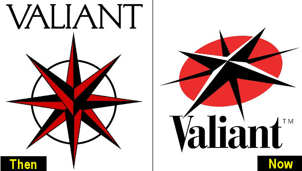
And Sans Serif.leonmallett wrote:I immediately like the logo at a tilt, as it may symbolise a lot, whilst also freshening up the original, which is cool.
The only thing I didn't like was that almost cursive lettering font. I would have preferred a more angular font and for VALIANT to be capitalised.

-
leonmallett

- My mind is sharp. Like a sharp thing.
- Posts: 9472
- Joined: Sun Jul 09, 2006 9:39 am
- Valiant fan since: 2006
- Favorite character: Shadowman (Hall version)
- Favorite title: Shadowman (under Hall)
- Favorite writer: Fred Van Lente
- Favorite artist: Clayton Henry
- Location: hunting down paulsmith56 somewhere in the balti belt...
Agreed. The serif adds to the cursive feel.Chiclo wrote:And Sans Serif.leonmallett wrote:I immediately like the logo at a tilt, as it may symbolise a lot, whilst also freshening up the original, which is cool.
The only thing I didn't like was that almost cursive lettering font. I would have preferred a more angular font and for VALIANT to be capitalised.
VEI - I look forward to you one day publishing MORE than 9-10 books per month

-
Daniel Jackson

- A toast to the return of Valiant!
- Posts: 38007
- Joined: Mon Jun 21, 2004 8:33 pm
It is strange that they didn't capitalize the letters like they did in the early days, but I think I can get used to it this way as well.leonmallett wrote:I immediately like the logo at a tilt, as it may symbolise a lot, whilst also freshening up the original, which is cool.
The only thing I didn't like was that almost cursive lettering font. I would have preferred a more angular font and for VALIANT to be capitalised.
-
Cyberstrike

- Consider it mine!
- Posts: 5220
- Joined: Sat Oct 07, 2006 9:07 am
- Valiant fan since: Unity 1992
- Favorite character: Solar, Man of the Atom
- Favorite title: Unity
- Favorite writer: Jim Starlin
- Favorite artist: Jim Starlin
- Location: Indianapolis, Indiana
- Contact:
-
cobra_commander

- Dude...one word - Pterodactyls!
- Posts: 7105
- Joined: Tue Aug 15, 2006 7:38 am
- Location: In front of my xbox 360
-
ManofTheAtom
- Deathmate was cool
- Posts: 13408
- Joined: Wed Feb 04, 2004 5:19 pm
- Location: Mexico City
- Contact:
-
ManofTheAtom
- Deathmate was cool
- Posts: 13408
- Joined: Wed Feb 04, 2004 5:19 pm
- Location: Mexico City
- Contact:
-
cobra_commander
- Dude...one word - Pterodactyls!
- Posts: 7105
- Joined: Tue Aug 15, 2006 7:38 am
- Location: In front of my xbox 360
-
cobra_commander
- Dude...one word - Pterodactyls!
- Posts: 7105
- Joined: Tue Aug 15, 2006 7:38 am
- Location: In front of my xbox 360
-
ManofTheAtom
- Deathmate was cool
- Posts: 13408
- Joined: Wed Feb 04, 2004 5:19 pm
- Location: Mexico City
- Contact:
-
cobra_commander
- Dude...one word - Pterodactyls!
- Posts: 7105
- Joined: Tue Aug 15, 2006 7:38 am
- Location: In front of my xbox 360


-
cobra_commander
- Dude...one word - Pterodactyls!
- Posts: 7105
- Joined: Tue Aug 15, 2006 7:38 am
- Location: In front of my xbox 360
-
cinlach@aol.com
- kneel before zod! snoochie boochies!!
- Posts: 4067
- Joined: Mon May 03, 2004 9:04 pm
- Valiant fan since: From the beginning...
- Favorite character: Wow, who can pick just one?
- Favorite writer: FVL FTW!
- Location: Greenville, SC
- Contact:
i miss the "V" aspect front and center and i also wish the type was all caps.greg wrote:
but that being said, it is striking and simple.
it'll look good reduced to a thumbnail and plastered on the top left hand corner of a book.
it's bright, uncluttered and distinct.
those are all good design elements folks...
kudos to VEI for continuing to show class and forethought in their actions.
WWSLJD, MF?

andrew wrote:i wonder how i'd feel if i paid a designer for a logo and got pretty much the original back in a different perspective...
As many have posted, it is a new take on the old logo.
The whole point of changing this logo is to send a message of the things which are new and refreshing, yet the same as they used to be (beginning of VH1 universe).
Compare this logo with the logo used in the last half of the VH1 printings. Which one evokes a feeling of connectedness with the original logo, corporate culture mentality and storytelling mythos?
400yrs wrote:Good thing you didn't buy VALIANT then.andrew wrote:i wonder how i'd feel if i paid a designer for a logo and got pretty much the original back in a different perspective...
I like the logo. True to the original, but looks much different at the same time.
I like reading that they hired that dude to design it. That tells me that they are investing heavily and are serious about this thing.
I'd like to see the compass in red and white with the circle in black...
then again.. I changed my mind. The red circle definitely points to a Rai/Bloodshot...
Last edited by yardstick on Thu Aug 16, 2007 1:25 pm, edited 1 time in total.
IanAlexavier wrote:Looks good to me!!
Im wondering how much they paid for that chosen design. When people create a logo they usually create 4 or 5 designs and run them by the purchasers.
Having this done isnt cheap, ESPECIALLY with who they had do it for them!
VEI is into this big time!
I wouldnt mind seeing the other "unapproved" designs also...
Heath wrote:I like the logo, but don't quite love it yet. It looks like someone modified the original logo without really knowing what the logo was about. The distinct "V" in the compass is gone for one thing. But it does say "We're the new Valiant, but we're a lot like the classic VALIANT." That's a good thing, so for that reason I like it.
It would have been cool if there had been an open contest among the fans for a new logo design. I wonder what some of us would have come up with and if it would have been any better.
The distinct V is not gone. It is still there in the top left part of the compass. It is just in black and white now, instead of red and black.
But you did hit the nail on the head:
"We're the new Valiant, but we're a lot like the classic VALIANT."