Harbinger HC Promotional Ideas
Moderators: Daniel Jackson, greg
- Daniel Jackson
- A toast to the return of Valiant!

- Posts: 38007
- Joined: Mon Jun 21, 2004 8:33 pm
- whovianone
- ...it hurts so much ...my brain hurts!

- Posts: 3240
- Joined: Fri Feb 02, 2007 10:15 am
- Location: Kettering, OH
- ManofTheAtom
- Deathmate was cool

- Posts: 13407
- Joined: Wed Feb 04, 2004 5:19 pm
- Location: Mexico City
- Contact:
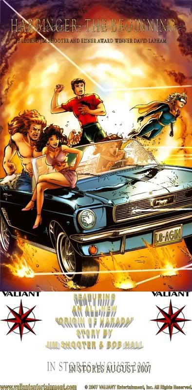
How's this?Dr. Solar wrote:I think your updated version is even harder to read. When I look at the text that says "with a new story by Jim Shooter", it makes my eyes hurt, and I don't want to look at it.ManofTheAtom wrote:My problem with x-o's version is the black border and black background for the text. That's too much black ink on a white shirt.
The reason it's hard to read is due to the size of the image as it appears on the screen here. The one I have is much bigger and much clearer to make out.
I've made the correction to the credits.
Think clarity.
In terms of raising general awareness, you need something that gets the idea across FAST, because people aren't gonna spend tons of time trying to figure out what it says. I would suggest something like:
HARBINGER: THE BEGINNING
[ image ]
[ image ]
[ image ]
[ image ]
[ image ]
[ image ]
[ image ]
[ image ]
[ image ]
[ image ]
[ image ]
VALIANT
AUGUST 2007
featuring a new story
"The Origin Of Harada"
by Jim Shooter & Bob Hall
all with BIG easy to read letters. What you did looks cool, but this is really a marketing project, not a "cool" project. The best thing in terms of promoting the return of VALIANT will be something that gets the idea across quickly. "Harbinger, looks cool, August". That's what you want people to see, so that it raises general awareness. There should be more information who want to get more, but the easier it is to get the info from what is printed the better.
The font you have now with the shadow effects make it extra hard to get that information from the design.
Also keep in mind that screen printed t-shirts have much lower resolution than a computer monitor.
Hope this helps, I think it is great that you are doing this work to get this done, and this criticism is meant only to make this project even more effective at promoting the new VALIANT.

- evil greg
- a Ph.D. in horribleness

- Posts: 57
- Joined: Tue Jun 06, 2006 6:06 am
- Location: The Shadow Knows...
Enough with the text having shadows... you'd think this was a flyer for some kind of "Shadow" man.ManofTheAtom wrote:How's this?
Wait...
What is evil? Some say it is the exact opposite of good. So what is good? Some say pickles are good. If that's true, I'll take evil, because evil is the exact opposite of pickles. Yuck.
- evil greg
- a Ph.D. in horribleness

- Posts: 57
- Joined: Tue Jun 06, 2006 6:06 am
- Location: The Shadow Knows...
You just want "Harbinger graphic Lite".Chiclo wrote:Still too busy, MotA.
We have a saying. Keep it simple. I think that is the best advice here.
What is evil? Some say it is the exact opposite of good. So what is good? Some say pickles are good. If that's true, I'll take evil, because evil is the exact opposite of pickles. Yuck.
- evil greg
- a Ph.D. in horribleness

- Posts: 57
- Joined: Tue Jun 06, 2006 6:06 am
- Location: The Shadow Knows...
You got some kind of a problem with a flyer that says:Chiclo wrote:Yes, I think that might be the right direction.evil greg wrote:You just want "Harbinger graphic Lite".Chiclo wrote:Still too busy, MotA.
We have a saying. Keep it simple. I think that is the best advice here.
"FEABURING"
"AN ALL-MEW"
"ORIQIN OF HARADA"
???
What is evil? Some say it is the exact opposite of good. So what is good? Some say pickles are good. If that's true, I'll take evil, because evil is the exact opposite of pickles. Yuck.
- whovianone
- ...it hurts so much ...my brain hurts!

- Posts: 3240
- Joined: Fri Feb 02, 2007 10:15 am
- Location: Kettering, OH
- whovianone
- ...it hurts so much ...my brain hurts!

- Posts: 3240
- Joined: Fri Feb 02, 2007 10:15 am
- Location: Kettering, OH
- ManofTheAtom
- Deathmate was cool

- Posts: 13407
- Joined: Wed Feb 04, 2004 5:19 pm
- Location: Mexico City
- Contact:
- BrianT
- 5318008

- Posts: 545
- Joined: Sun Oct 23, 2005 5:11 pm
- Favorite character: X-O Manowar/Ninjak/Armorines
- Location: Philly
The big *SQUEE* picture will do that, not some hard to read type. If the pic doesn't then "Valiant", "Harbinger", "Jim Shooter" or "David Lapham" will. The rest is excess clutter and distracting. And this'll be on a t-shirt, the person needs to be able to glean the whole message of the shirt in the 3 seconds it takes to walk past you before the awkward point where they feel like a stranger thinks they're staring at them.ManofTheAtom wrote:Simple = Bland.Chiclo wrote:Still too busy, MotA.
We have a saying. Keep it simple. I think that is the best advice here.
The promo should capture people's attention.
If you want to make a lasting impression, print out a few hundred of Greg's flyer and hand those out while wearing the t-shirt. (Anyone know if you need a permit/clearance to hand out flyers at cons?)
- ManofTheAtom
- Deathmate was cool

- Posts: 13407
- Joined: Wed Feb 04, 2004 5:19 pm
- Location: Mexico City
- Contact:
That's the thing.
You say it's hard to read, but it's not.
I'm looking at it and in the big size it's going to be it's really clear. You're looking at a distorted image that's a result of photobucket making it smaller than it really is. That distortion is causing the text to be unreadable.

This is somewhat closer to the actual image size.
This image is 665 by 500 pixels, while the actual image is 994 by 747 pixels, which makes the text even easier to read.
You say it's hard to read, but it's not.
I'm looking at it and in the big size it's going to be it's really clear. You're looking at a distorted image that's a result of photobucket making it smaller than it really is. That distortion is causing the text to be unreadable.

This is somewhat closer to the actual image size.
This image is 665 by 500 pixels, while the actual image is 994 by 747 pixels, which makes the text even easier to read.
- evil greg
- a Ph.D. in horribleness

- Posts: 57
- Joined: Tue Jun 06, 2006 6:06 am
- Location: The Shadow Knows...
Sorry, but that image is larger and clearer than any t-shirt would be, and it's still hard to read.ManofTheAtom wrote:That's the thing.
You say it's hard to read, but it's not.
I'm looking at it and in the big size it's going to be it's really clear. You're looking at a distorted image that's a result of photobucket making it smaller than it really is. That distortion is causing the text to be unreadable.
This is somewhat closer to the actual image size.
This image is 665 by 500 pixels, while the actual image is 994 by 747 pixels, which makes the text even easier to read.
With all due respect, it looks like something a 12 year old would make
after spending about 3 minutes playing with a graphics program...
"Shadows - cool!"
"Text on top of text - awesome!"
"Block letters and shadows, I think I need to change my pants!"
To put it bluntly, it sucks. Hard.
I'm embarrassed for you.
What is evil? Some say it is the exact opposite of good. So what is good? Some say pickles are good. If that's true, I'll take evil, because evil is the exact opposite of pickles. Yuck.
- Chiclo
- I'm Chiclo. My strong Dongs paid off well.

- Posts: 22003
- Joined: Tue Oct 03, 2006 1:09 am
- Favorite character: Kris
- Location: Texas
- Contact:
Think about billboards. That's what we want here, billboards.
Billboards have a simple message and an eye-catching image. They don't involve a paragraph, and the text is made as cleanly and easy to read as possible.
Simple = bland = effective. If it is too cluttered and especially with a font that is that difficult to read, then we basically are just advertising to each other. You don't have to convince me to buy a Harbinger HC - I've already got one on order with my LCS.
- greg
- The admin around here must be getting old and soft.

- Posts: 22883
- Joined: Wed Feb 04, 2004 9:39 am
- Valiant fan since: Rai #0
- Favorite character: Depends on title
- Favorite title: Depends on writer
- Favorite writer: Depends on artist
- Favorite artist: Depends on character
- Location: Indoors
- Contact:
That's enough! I think you need a time out.evil greg wrote:With all due respect, it looks like something a 12 year old would make
after spending about 3 minutes playing with a graphics program...
"Shadows - cool!"
"Text on top of text - awesome!"
"Block letters and shadows, I think I need to change my pants!"
To put it bluntly, it sucks. Hard.
I'm embarrassed for you.
You are not allowed to post for 12 hours.
- Chiclo
- I'm Chiclo. My strong Dongs paid off well.

- Posts: 22003
- Joined: Tue Oct 03, 2006 1:09 am
- Favorite character: Kris
- Location: Texas
- Contact:
I don't really think surface area will be much of an issue. Kind of like getting these t-shirts in size small, not much to worry about there.
Evil Greg raises a good point, though. T-Shirt printing does not produce nearly so sharp an image as making a jpeg. So, you'll have a sharp drop in clarity to begin with.
Evil Greg raises a good point, though. T-Shirt printing does not produce nearly so sharp an image as making a jpeg. So, you'll have a sharp drop in clarity to begin with.
- leonmallett
- My mind is sharp. Like a sharp thing.

- Posts: 9472
- Joined: Sun Jul 09, 2006 9:39 am
- Valiant fan since: 2006
- Favorite character: Shadowman (Hall version)
- Favorite title: Shadowman (under Hall)
- Favorite writer: Fred Van Lente
- Favorite artist: Clayton Henry
- Location: hunting down paulsmith56 somewhere in the balti belt...
Evil Greg is like a blunt instrument isn't he?greg wrote:That's enough! I think you need a time out.evil greg wrote:With all due respect, it looks like something a 12 year old would make
after spending about 3 minutes playing with a graphics program...
"Shadows - cool!"
"Text on top of text - awesome!"
"Block letters and shadows, I think I need to change my pants!"
To put it bluntly, it sucks. Hard.
I'm embarrassed for you.
You are not allowed to post for 12 hours.
VEI - I look forward to you one day publishing MORE than 9-10 books per month
- whovianone
- ...it hurts so much ...my brain hurts!

- Posts: 3240
- Joined: Fri Feb 02, 2007 10:15 am
- Location: Kettering, OH
I think it's not a matter of if it's easy to read. it's a matter of getting it all in within a couple seconds. It needs to stand out, yes, but people ignore busy things. Even if it looks cool. The average person doesn't want to work to find something new out. That's why most logos for national companies are not busy.ManofTheAtom wrote:That's the thing.
You say it's hard to read, but it's not.
I'm looking at it and in the big size it's going to be it's really clear. You're looking at a distorted image that's a result of photobucket making it smaller than it really is. That distortion is causing the text to be unreadable.
This is somewhat closer to the actual image size.
This image is 665 by 500 pixels, while the actual image is 994 by 747 pixels, which makes the text even easier to read.
PS - Just out of curiosity, do you have to sharpen Evil Greg, or is he always that dangerous?
- leonmallett
- My mind is sharp. Like a sharp thing.

- Posts: 9472
- Joined: Sun Jul 09, 2006 9:39 am
- Valiant fan since: 2006
- Favorite character: Shadowman (Hall version)
- Favorite title: Shadowman (under Hall)
- Favorite writer: Fred Van Lente
- Favorite artist: Clayton Henry
- Location: hunting down paulsmith56 somewhere in the balti belt...
I think Evil Greg stays forever sharp, a blade keenly maintained on the rocks of life's miseries and on those stones thrown in his vicinity.whovianone wrote:I think it's not a matter of if it's easy to read. it's a matter of getting it all in within a couple seconds. It needs to stand out, yes, but people ignore busy things. Even if it looks cool. The average person doesn't want to work to find something new out. That's why most logos for national companies are not busy.ManofTheAtom wrote:That's the thing.
You say it's hard to read, but it's not.
I'm looking at it and in the big size it's going to be it's really clear. You're looking at a distorted image that's a result of photobucket making it smaller than it really is. That distortion is causing the text to be unreadable.
This is somewhat closer to the actual image size.
This image is 665 by 500 pixels, while the actual image is 994 by 747 pixels, which makes the text even easier to read.
PS - Just out of curiosity, do you have to sharpen Evil Greg, or is he always that dangerous?
VEI - I look forward to you one day publishing MORE than 9-10 books per month
- ManofTheAtom
- Deathmate was cool

- Posts: 13407
- Joined: Wed Feb 04, 2004 5:19 pm
- Location: Mexico City
- Contact:
He's harmless, heh.greg wrote:That's enough! I think you need a time out.evil greg wrote:With all due respect, it looks like something a 12 year old would make
after spending about 3 minutes playing with a graphics program...
"Shadows - cool!"
"Text on top of text - awesome!"
"Block letters and shadows, I think I need to change my pants!"
To put it bluntly, it sucks. Hard.
I'm embarrassed for you.
You are not allowed to post for 12 hours.
I took no offense, I took what he said in jest.
- ManofTheAtom
- Deathmate was cool

- Posts: 13407
- Joined: Wed Feb 04, 2004 5:19 pm
- Location: Mexico City
- Contact:
I'm not using a JPEG/JPG for the shirt, I'm using a higher resolution BMP in which the text doesn't look as blurry.Chiclo wrote:I don't really think surface area will be much of an issue. Kind of like getting these t-shirts in size small, not much to worry about there.
Evil Greg raises a good point, though. T-Shirt printing does not produce nearly so sharp an image as making a jpeg. So, you'll have a sharp drop in clarity to begin with.
If the problem is the font then tell me which font you'd like me to use. I have almost a 1,000.


