Harbinger HC Promotional Ideas
Moderators: Daniel Jackson, greg
-
Dr. Solar

- Spanked like a 4 year old in K-Mart.

- Posts: 10898
- Joined: Sat May 15, 2004 8:09 pm
- Favorite character: Sven
- Favorite title: Psi-Lords #2
- Location: Los Angeles Surviving Sectors
In all seriousness though, it is awesome you are taking the time to put this together, but here's some constructive criticism.
From a graphic design point of view, the writing just obscures the artwork and is unreadable, taking away from both the artwork and the information.
Could you put the lettering below the image? The lettering at the top looks OK, but could be made to -pop- out more.
If this is meant to be a marketing tool, people need to know what you are marketing.
$0.02.
-
Ryan

- I would buy anything about these characters, sadly.
- Posts: 3477
- Joined: Sun Feb 08, 2004 9:51 pm
Are you using photoshop? If so just try adding some layer styles to the text like a drop shadow or something, that would help to bring the text forward. And yeah I keep getting distracted by Flamingo's -ahem- so maybe that's why I'm having troubleManofTheAtom wrote: The image I have on the comp is much bigger than this one (there must be a size limit on the board for linked images), but if you have any suggestions for other colors, I'm listening.
-
Ryan
- I would buy anything about these characters, sadly.
- Posts: 3477
- Joined: Sun Feb 08, 2004 9:51 pm
I agree with the Doc and I also want to thank MOTA for being so pro-active in this.Dr. Solar wrote:In all seriousness though, it is awesome you are taking the time to put this together, but here's some constructive criticism.
From a graphic design point of view, the writing just obscures the artwork and is unreadable, taking away from both the artwork and the information.
Could you put the lettering below the image? The lettering at the top looks OK, but could be made to -pop- out more.
If this is meant to be a marketing tool, people need to know what you are marketing.
$0.02.
-
BrianT

- 5318008

- Posts: 545
- Joined: Sun Oct 23, 2005 5:11 pm
- Favorite character: X-O Manowar/Ninjak/Armorines
- Location: Philly
I just looked at the SDCC site and the con is July 26-29, whereas the orders are due for the hardcover by July 5th, so as nice an idea as the t-shirt is, we should try to come up with something(s) that can be executed sufficiently prior to the ordering deadline.
Also, will the HC be available on Amazon.com? If so, it might also be a good idea to plug that as well.
Also, will the HC be available on Amazon.com? If so, it might also be a good idea to plug that as well.
-
x-omatic
- Did someone call for a Hired Gun?
- Posts: 6172
- Joined: Wed Feb 04, 2004 4:00 pm
- Location: Phoenix, AZ
- Contact:
Maybe something like this?

http://chrismorrillart.com/" onclick="window.open(this.href);return false;
-
ManofTheAtom
- Deathmate was cool
- Posts: 13410
- Joined: Wed Feb 04, 2004 5:19 pm
- Location: Mexico City
- Contact:
Well, for the text I'm using Word's Word Art, so I could add some drop shadow effect, no problem.Ryan wrote:Are you using photoshop? If so just try adding some layer styles to the text like a drop shadow or something, that would help to bring the text forward. And yeah I keep getting distracted by Flamingo's -ahem- so maybe that's why I'm having troubleManofTheAtom wrote: The image I have on the comp is much bigger than this one (there must be a size limit on the board for linked images), but if you have any suggestions for other colors, I'm listening.
For images I use MS Paint, I don't have photoshop or any of those fancy art programs, heh.
-
ManofTheAtom
- Deathmate was cool
- Posts: 13410
- Joined: Wed Feb 04, 2004 5:19 pm
- Location: Mexico City
- Contact:
Retailers can increase their orders up to two weeks before the item ships, so even promoting it at SDCC before August 1st works because long as it doesn't come out the first week of August retailers would still have time.Brian Thomer wrote:I just looked at the SDCC site and the con is July 26-29, whereas the orders are due for the hardcover by July 5th, so as nice an idea as the t-shirt is, we should try to come up with something(s) that can be executed sufficiently prior to the ordering deadline.
Also, will the HC be available on Amazon.com? If so, it might also be a good idea to plug that as well.
But like I said, we could maybe break off into groups and produce t-shirts at different places and hand them out.
We could all use the same image to make our own batch of t-shirts.
-
ManofTheAtom
- Deathmate was cool
- Posts: 13410
- Joined: Wed Feb 04, 2004 5:19 pm
- Location: Mexico City
- Contact:
Heh.Chiclo wrote:Will there be any way those of us who aren't cool enough to get to the SDCC (I went in 2006, dang it) could get one?
And... Pesos or Nuevo Pesos?
Well, we dropped the "Nuevo" a while ago, so the price is in "Nuevo" Pesos.
In old Pesos you'd add three zeros to the price, so 25 (new) pesos becomes 25,000 (old) pesos.
The only way I could get one of the t-shirts I'm getting made to you would be if someone else that I gave one to at the con could send you yours in the mail or something.
-
ManofTheAtom
- Deathmate was cool
- Posts: 13410
- Joined: Wed Feb 04, 2004 5:19 pm
- Location: Mexico City
- Contact:
-
ManofTheAtom
- Deathmate was cool
- Posts: 13410
- Joined: Wed Feb 04, 2004 5:19 pm
- Location: Mexico City
- Contact:
-
BrianT
- 5318008
- Posts: 545
- Joined: Sun Oct 23, 2005 5:11 pm
- Favorite character: X-O Manowar/Ninjak/Armorines
- Location: Philly
Well it would have to not come out during the first two weeks of August because SDCC is during the last week of July. And considering most people will probably wait to tell their retailer to order it for them until they go to the shop next (which would likely at the earliest be Wed, Aug 1st), that's at least 3 August shipping weeks that SDCC is too late for. Leaving only 2.ManofTheAtom wrote:Retailers can increase their orders up to two weeks before the item ships, so even promoting it at SDCC before August 1st works because long as it doesn't come out the first week of August retailers would still have time.
Welcome back, BTW.
-
ManofTheAtom
- Deathmate was cool
- Posts: 13410
- Joined: Wed Feb 04, 2004 5:19 pm
- Location: Mexico City
- Contact:
Thanks, heh.Brian Thomer wrote:Well it would have to not come out during the first two weeks of August because SDCC is during the last week of July. And considering most people will probably wait to tell their retailer to order it for them until they go to the shop next (which would likely at the earliest be Wed, Aug 1st), that's at least 3 August shipping weeks that SDCC is too late for. Leaving only 2.ManofTheAtom wrote:Retailers can increase their orders up to two weeks before the item ships, so even promoting it at SDCC before August 1st works because long as it doesn't come out the first week of August retailers would still have time.
Welcome back, BTW.
Well, we can always do batches.
I mean, I can take care of the SDCC t-shirt batch while someone else in the US could handle the Pre-SDCC batch.
Once I have the sizes from everyone who needs a t-shirt I can take care of it in a day, two tops (one to buy the t-shirts and another to get them printed). The problem is sending them out.
It takes six to eight weeks for something from Mexico to arrive in the US and by then it be so late that it wouldn't be worth doing.
-
Chiclo

- I'm Chiclo. My strong Dongs paid off well.
- Posts: 22005
- Joined: Tue Oct 03, 2006 1:09 am
- Favorite character: Kris
- Location: Texas
- Contact:
Yeah, they are weird about bringing shirts across the US-Mexico border.ManofTheAtom wrote:Heh.Chiclo wrote:Will there be any way those of us who aren't cool enough to get to the SDCC (I went in 2006, dang it) could get one?
And... Pesos or Nuevo Pesos?
Well, we dropped the "Nuevo" a while ago, so the price is in "Nuevo" Pesos.
In old Pesos you'd add three zeros to the price, so 25 (new) pesos becomes 25,000 (old) pesos.
The only way I could get one of the t-shirts I'm getting made to you would be if someone else that I gave one to at the con could send you yours in the mail or something.
I once was detained for an hour and forty-five minutes under suspicion of shirt smuggling.
-
ManofTheAtom
- Deathmate was cool
- Posts: 13410
- Joined: Wed Feb 04, 2004 5:19 pm
- Location: Mexico City
- Contact:
-
ManofTheAtom
- Deathmate was cool
- Posts: 13410
- Joined: Wed Feb 04, 2004 5:19 pm
- Location: Mexico City
- Contact:
-
BrianT
- 5318008
- Posts: 545
- Joined: Sun Oct 23, 2005 5:11 pm
- Favorite character: X-O Manowar/Ninjak/Armorines
- Location: Philly
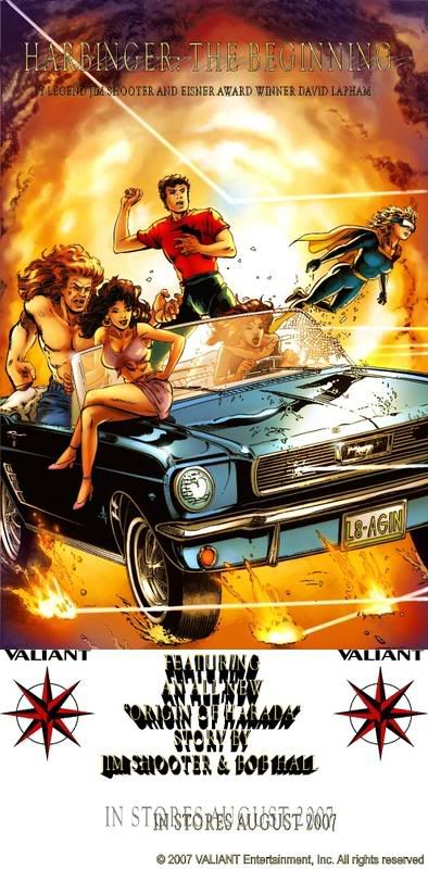
I'd try Shooter and Hall on the same line. This is gonna be on a T-shirt so the image can't be too long. The font is still hard to read.ManofTheAtom wrote:Ok, scroll up to see the revised image.Brian Thomer wrote:Sure. It's one more selling point.ManofTheAtom wrote:You guys think I should?
How does it look to you?
I think x-omatic's more simple design might be a better start, personally.
-
ManofTheAtom
- Deathmate was cool
- Posts: 13410
- Joined: Wed Feb 04, 2004 5:19 pm
- Location: Mexico City
- Contact:
My problem with x-o's version is the black border and black background for the text. That's too much black ink on a white shirt.
The reason it's hard to read is due to the size of the image as it appears on the screen here. The one I have is much bigger and much clearer to make out.
I've made the correction to the credits.
The reason it's hard to read is due to the size of the image as it appears on the screen here. The one I have is much bigger and much clearer to make out.
I've made the correction to the credits.
-
Dr. Solar
- Spanked like a 4 year old in K-Mart.
- Posts: 10898
- Joined: Sat May 15, 2004 8:09 pm
- Favorite character: Sven
- Favorite title: Psi-Lords #2
- Location: Los Angeles Surviving Sectors
I think your updated version is even harder to read. When I look at the text that says "with a new story by Jim Shooter", it makes my eyes hurt, and I don't want to look at it.ManofTheAtom wrote:My problem with x-o's version is the black border and black background for the text. That's too much black ink on a white shirt.
The reason it's hard to read is due to the size of the image as it appears on the screen here. The one I have is much bigger and much clearer to make out.
I've made the correction to the credits.
Think clarity.
In terms of raising general awareness, you need something that gets the idea across FAST, because people aren't gonna spend tons of time trying to figure out what it says. I would suggest something like:
HARBINGER: THE BEGINNING
[ image ]
[ image ]
[ image ]
[ image ]
[ image ]
[ image ]
[ image ]
[ image ]
[ image ]
[ image ]
[ image ]
VALIANT
AUGUST 2007
featuring a new story
"The Origin Of Harada"
by Jim Shooter & Bob Hall
all with BIG easy to read letters. What you did looks cool, but this is really a marketing project, not a "cool" project. The best thing in terms of promoting the return of VALIANT will be something that gets the idea across quickly. "Harbinger, looks cool, August". That's what you want people to see, so that it raises general awareness. There should be more information who want to get more, but the easier it is to get the info from what is printed the better.
The font you have now with the shadow effects make it extra hard to get that information from the design.
Also keep in mind that screen printed t-shirts have much lower resolution than a computer monitor.
Hope this helps, I think it is great that you are doing this work to get this done, and this criticism is meant only to make this project even more effective at promoting the new VALIANT.
-
betterthanezra
- Wanna see an unpublished Shadowman page?
- Posts: 12346
- Joined: Mon Feb 09, 2004 12:18 am
- Valiant fan since: 1991
- Favorite writer: Josh Dysart
- Location: Scoot over, I have to get in behind you.

-
Daniel Jackson

- A toast to the return of Valiant!
- Posts: 38007
- Joined: Mon Jun 21, 2004 8:33 pm