New Valiant Fans Logo?
Moderators: Daniel Jackson, greg
-
Byrneout

- ...and in THIS corner...

- Posts: 2706
- Joined: Fri Apr 02, 2004 12:26 pm
- Location: Originally Hell's Kitchen, NY - *SKREE* that "Clinton, NY" *SKREE* - now Cincinnati, OH
New Valiant Fans Logo?
Just looked up, and noticed we had a new logo for the Valiant Fans site.
Looks kind of militaristic... very cool.
Any insight on this, Greg?
Looks kind of militaristic... very cool.
Any insight on this, Greg?
-
Technique

- Thatched Roof Cottages!!!
- Posts: 5238
- Joined: Thu Feb 05, 2004 1:16 am
- Location: The S is for Sucks
http://www.valiantfans.com/forum/viewtopic.php?t=8340
Although this is probably a better location.
You like the militaristic look?
Although this is probably a better location.
You like the militaristic look?
-
Daniel Jackson

- A toast to the return of Valiant!
- Posts: 38007
- Joined: Mon Jun 21, 2004 8:33 pm
-
DawgPhan

- My posts are simmered in four flavors
- Posts: 11553
- Joined: Thu Feb 05, 2004 8:17 am
- Location: Atlanta, Georgia
Re: New Valiant Fans Logo?
This is so 1:45...Byrneout wrote:Just looked up, and noticed we had a new logo for the Valiant Fans site.
Looks kind of militaristic... very cool.
Any insight on this, Greg?
greg has been on since the change, but I think just to check it out...
-
Technique
- Thatched Roof Cottages!!!
- Posts: 5238
- Joined: Thu Feb 05, 2004 1:16 am
- Location: The S is for Sucks
I assume that Greg will say something.DawgPhan wrote:...
I dont know that we will ever really know, but I do like that it was immediately noticed and theories abounded after just minutes of the change...I really like you guys...
I think that he is an honest guy so I will take him at his word if he says that there was no outside influence.
-
greg

- The admin around here must be getting old and soft.

- Posts: 22880
- Joined: Wed Feb 04, 2004 9:39 am
- Valiant fan since: Rai #0
- Favorite character: Depends on title
- Favorite title: Depends on writer
- Favorite writer: Depends on artist
- Favorite artist: Depends on character
- Location: Indoors
- Contact:
Before conspiracy theories continue... 
I realized that I needed a "logo" for the ValiantFans.com site
on the last fan project. The certificates for the fan 'signature series'
needed to have a logo, but didn't need to use the Valiant compass.
(For printing new items, even certificates, I'm not using the compass.)
What I wound up using on that certificate was a graphic of a computer,
with the planet Earth and "ValiantFans.com" on it.
That was fine for then, but I still wanted something "more".
So, I've been working with a few ideas...
and what you see at the top left of the screen today
is the basic result.
There's a "big V" for Valiant, of course...
The "V" is in the shape of an "open book" for reading.
There's Earth... for our worldwide web location,
and there are "stripes" representing how Valiant fans
tend to "earn our stripes" by still caring after 10+ years.
(The stripes are also there to give the image some color.)
It's not perfect, by any means... but it is what it is.
The original design is more "square" than the one above.
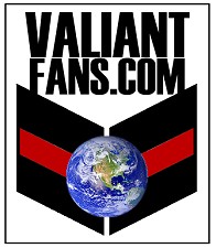
This design would take up too much space at the top of the page
here on the messageboard, so I moved the text to the right.
Judging by the reaction so far, I'd say it's mostly a curiosity
at the moment. This early, I'd say the verdict is still out...
I realized that I needed a "logo" for the ValiantFans.com site
on the last fan project. The certificates for the fan 'signature series'
needed to have a logo, but didn't need to use the Valiant compass.
(For printing new items, even certificates, I'm not using the compass.)
What I wound up using on that certificate was a graphic of a computer,
with the planet Earth and "ValiantFans.com" on it.
That was fine for then, but I still wanted something "more".
So, I've been working with a few ideas...
and what you see at the top left of the screen today
is the basic result.
There's a "big V" for Valiant, of course...
The "V" is in the shape of an "open book" for reading.
There's Earth... for our worldwide web location,
and there are "stripes" representing how Valiant fans
tend to "earn our stripes" by still caring after 10+ years.
(The stripes are also there to give the image some color.)
It's not perfect, by any means... but it is what it is.
The original design is more "square" than the one above.
This design would take up too much space at the top of the page
here on the messageboard, so I moved the text to the right.
Judging by the reaction so far, I'd say it's mostly a curiosity
at the moment. This early, I'd say the verdict is still out...
Last edited by greg on Mon Nov 07, 2005 3:20 pm, edited 1 time in total.
-
Technique
- Thatched Roof Cottages!!!
- Posts: 5238
- Joined: Thu Feb 05, 2004 1:16 am
- Location: The S is for Sucks
Why did all of these things "need" to have a new logo?greg wrote:...
I realized that I needed a "logo" for the ValiantFans.com site
on the last fan project. The certificates for the fan 'signature series'
needed to have a logo, but didn't need to use the Valiant compass.
(For printing new items, even certificates, I'm not using the compass.)
...
Be as honest and forthcoming as you can here
-
greg
- The admin around here must be getting old and soft.
- Posts: 22880
- Joined: Wed Feb 04, 2004 9:39 am
- Valiant fan since: Rai #0
- Favorite character: Depends on title
- Favorite title: Depends on writer
- Favorite writer: Depends on artist
- Favorite artist: Depends on character
- Location: Indoors
- Contact:
Before Valiant was sold in April 2005, the only comic books that hadTechnique wrote:Why did all of these things "need" to have a new logo?greg wrote:...
I realized that I needed a "logo" for the ValiantFans.com site
on the last fan project. The certificates for the fan 'signature series'
needed to have a logo, but didn't need to use the Valiant compass.
(For printing new items, even certificates, I'm not using the compass.)
...
Be as honest and forthcoming as you can here
been printed with Valiant characters (even in other forms) since 1996
had been "Acclaim Comics". If anyone referenced "Valiant Comics",
it was clear that they were talking about comics from 1996 or earlier.
Once the sale occurred, people started talking about Valiant again
in terms of "present" or "immediate future". As a result, things like the
Valiant name and Valiant symbol MIGHT mean an official thing again,
as opposed to ONLY meaning "the old stuff".
While VALIANTCOMICS.COM is my domain devoted to Valiant 1991-1996,
I am not opposed to expanding the breadth of coverage if Valiant returns.
In that scenario, VALIANTCOMICS.COM could be more official than it
has been in the past. Right now, VALIANTCOMICS.COM is still a fan site,
but it could be more someday. Currently, it's only focused on the past.
VALIANTFANS.COM is clearly a fan site. It will always be a fan site.
The focus of ValiantFans.com is past, present, and future.
Present usage of trademarks is the concern I am addressing.
ValiantFans.com should not be confused by anyone who is new
to the site as being "official" with regard to past, present, or future.
It is my belief that the Valiant compass will return in some official form.
Since the sale of Valiant in April 2005, it has been "possible" to see that
official return any time. It still could occur at any time.
As a result, I don't plan to use the Valiant compass on newly created items
(like fan project certificates) with references to ValiantFans.com.
There's nothing "official" about the fan projects, and they shouldn't
appear to be "official" with regard to the Valiant compass.
Since I need to use something on the certificates, it makes sense to me
to create a new logo altogether... something that won't be confused with
official products when they arrive.
I would be happy to incorporate the Valiant compass into this logo (or some other),
if I could guarantee approval from whoever is seeing to the compass' return.
Thus far, I have not received that approval, so I will err on the side of caution.
Last edited by greg on Mon Nov 07, 2005 4:27 pm, edited 1 time in total.
-
BrianT
- 5318008

- Posts: 545
- Joined: Sun Oct 23, 2005 5:11 pm
- Favorite character: X-O Manowar/Ninjak/Armorines
- Location: Philly
Completely makes sense to me. Marks identify a source. The original Valiant logo identifies Valiant as a source so when consumers see it they identify the mark with the company. ValiantFans.com is not that company. Avoiding this confusion is particularly good, since several people plan to boycott any VIP "Valiant" merchandise. ValiantFans.com having its own logo prevents people from associating this site with any other company and allows ValiantFans.com to get the recognition it deserves for the hard work it does.
EDIT: I'm going to assume that this new logo is going to appear on the Zoom Suit ValiantFans.com Exclusive Certificate (at least it should). This gives this site the credit for organizing that exclusive offer, not any other organization. I think this site deserves the recognition for its efforts.
EDIT: I'm going to assume that this new logo is going to appear on the Zoom Suit ValiantFans.com Exclusive Certificate (at least it should). This gives this site the credit for organizing that exclusive offer, not any other organization. I think this site deserves the recognition for its efforts.
Last edited by BrianT on Mon Nov 07, 2005 3:54 pm, edited 1 time in total.
-
chuckwood

- If you gave Aric hugs and kisses, would it be XOXO X-O?

- Posts: 49
- Joined: Fri Oct 14, 2005 8:18 am
Looks much better. The new logo is pretty good, it will take time to get used to it, more time because the compass is such a well created logo.greg wrote:That's probably a problem from "shrinking it down".chuckwood wrote:The lettering on the side is also too bold (I can not see the spaces in the A)
I think I've revised it to fix the "A".
-
greg
- The admin around here must be getting old and soft.
- Posts: 22880
- Joined: Wed Feb 04, 2004 9:39 am
- Valiant fan since: Rai #0
- Favorite character: Depends on title
- Favorite title: Depends on writer
- Favorite writer: Depends on artist
- Favorite artist: Depends on character
- Location: Indoors
- Contact:
For a little more info... let me add this:
I have not been asked to stop using the Valiant compass on this website.
My goal was to come up with a single logo for use on both the website
AND the certificates associated with the fan projects.
Since I don't plan to print new certificates with the compass logo
(after the April 2005 sale of the Valiant/Acclaim properties), then
I needed something new for the certificates.
Since I'll be using something new on the certificates, I also want it to be
a logo that fits the website. Technically, the certificate is driving this change.
As far as the "stripes" or even the font goes... they aren't set in stone.
I could easily change (or remove) the stripes, or the font,
but keep the "big V", the Earth, and the domain name the same.
I think that would keep the logo recognizable, and provide some variety.
(I also plan to incorporate the year into the graphic on certificates.)
-
Technique
- Thatched Roof Cottages!!!
- Posts: 5238
- Joined: Thu Feb 05, 2004 1:16 am
- Location: The S is for Sucks
Since you'll be paying attention to this thread...
Who's site is this:
http://www.shooterswork.com/index.html
 (because I know it's coming )
Who's site is this:
http://www.shooterswork.com/index.html
-
wrunow
- Where are you now?
- Posts: 3658
- Joined: Mon Feb 23, 2004 10:10 am
- Valiant fan since: 1991
- Favorite character: They killed her off!
- Favorite title: Harbinger
- Favorite writer: Dysart
- Favorite artist: Nord
- Location: York, Maine
I've never seen that before, that's quite interesting, I am surprized no one has brought it up here before.Technique wrote:Since you'll be paying attention to this thread...
Who's site is this:
http://www.shooterswork.com/index.html
I am selling "nothing" on ebay-yet.

-
chuckwood
- If you gave Aric hugs and kisses, would it be XOXO X-O?
- Posts: 49
- Joined: Fri Oct 14, 2005 8:18 am
oldjello wrote:No... it's not you. It's me too. It looks like the earth is hangliding.Jaknife wrote:i think it would be better if the two 'V' halves were joined. maybe thats just me.
I'm going to start on some animated avatars, relevant to Valiant titles.
If any are successful, I'll post 'em.
please let them be successful
please let them be successful
please let them be successful
-
Unblessed

- I must be flogged.
- Posts: 5533
- Joined: Mon Jan 03, 2005 11:00 pm
- Location: Slippin' through the trees, stanglin' the breeze
Um. anyone else think: VALIANT ON INFINITE EARTHSchuckwood wrote:oldjello wrote:No... it's not you. It's me too. It looks like the earth is hangliding.Jaknife wrote:i think it would be better if the two 'V' halves were joined. maybe thats just me.
I'm going to start on some animated avatars, relevant to Valiant titles.
If any are successful, I'll post 'em.
please let them be successful
please let them be successful
please let them be successful
~Unblessed
-
oldjello
- Clinkin' bottles with Aram
- Posts: 2838
- Joined: Wed Dec 29, 2004 12:45 am
- Valiant fan since: 1992
- Favorite title: Rai (before the Future Force)
- Location: Hanging with Wayne and Garth
I'm going to work on a Harbinger logo, Shadowman logo, perhaps something with Rai #0, and Solar. Any suggestions I will try and animate. I just got back from a Photoshop Seminar in Chicago, and I have tons of ideas. I may post them, and if you like them, use them.chuckwood wrote:oldjello wrote:No... it's not you. It's me too. It looks like the earth is hangliding.Jaknife wrote:i think it would be better if the two 'V' halves were joined. maybe thats just me.
I'm going to start on some animated avatars, relevant to Valiant titles.
If any are successful, I'll post 'em.
please let them be successful
please let them be successful
please let them be successful

-
Daniel Jackson
- A toast to the return of Valiant!
- Posts: 38007
- Joined: Mon Jun 21, 2004 8:33 pm
I don't know how well it would work, but maybe you could merge all of them in some form or another.oldjello wrote:I'm going to work on a Harbinger logo, Shadowman logo, perhaps something with Rai #0, and Solar. Any suggestions I will try and animate. I just got back from a Photoshop Seminar in Chicago, and I have tons of ideas. I may post them, and if you like them, use them.chuckwood wrote:oldjello wrote:No... it's not you. It's me too. It looks like the earth is hangliding.Jaknife wrote:i think it would be better if the two 'V' halves were joined. maybe thats just me.
I'm going to start on some animated avatars, relevant to Valiant titles.
If any are successful, I'll post 'em.
please let them be successful
please let them be successful
please let them be successful