Harbinger HC Promotional Ideas
Moderators: Daniel Jackson, greg
-
ManofTheAtom
- Deathmate was cool

- Posts: 13456
- Joined: Wed Feb 04, 2004 5:19 pm
- Location: Mexico City
- Contact:
-
Dr. Solar
- Spanked like a 4 year old in K-Mart.
- Posts: 10898
- Joined: Sat May 15, 2004 8:09 pm
- Favorite character: Sven
- Favorite title: Psi-Lords #2
- Location: Los Angeles Surviving Sectors
Have you ever looked at some dude in a death metal shirt were the band name looks like it is written in splattered blood and is pretty much unreadable? I have. Many time. No matter how cool the picture of the viking with the giant axe fighting the demon on top of the glacier is, I say "SQUEE it. I don't care enough to figure out what band that is".ManofTheAtom wrote:Simple = Bland.
The promo should capture people's attention.
That is what the writing is like with all the shadows, non-black coloring, etc.
Simple = effective = sales = more new VALIANT comics.
Yes it may be bland, but do you want exciting shirt with funky effects that you like and NO VALIANT books in the future, or do you want a bland shirt and MANY more VALIANT books to read in the future?
Any shirt made for marketing and advertising purposes should follow sound marketing and advertising principles.
-
ManofTheAtom
- Deathmate was cool
- Posts: 13456
- Joined: Wed Feb 04, 2004 5:19 pm
- Location: Mexico City
- Contact:
That's what I don't get.Dr. Solar wrote:Have you ever looked at some dude in a death metal shirt were the band name looks like it is written in splattered blood and is pretty much unreadable? I have. Many time. No matter how cool the picture of the viking with the giant axe fighting the demon on top of the glacier is, I say "SQUEE it. I don't care enough to figure out what band that is".ManofTheAtom wrote:Simple = Bland.
The promo should capture people's attention.
That is what the writing is like with all the shadows, non-black coloring, etc.
Simple = effective = sales = more new VALIANT comics.
Yes it may be bland, but do you want exciting shirt with funky effects that you like and NO VALIANT books in the future, or do you want a bland shirt and MANY more VALIANT books to read in the future?
Any shirt made for marketing and advertising purposes should follow sound marketing and advertising principles.
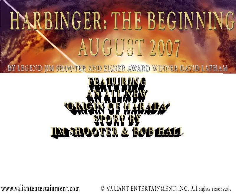
The first design I did was just that but then I was asked to modify it, which I did, yet those modifications don't reach the level you're talking about.
There's the image, the two logos, and the clear/readable text, which says the same thing as the ad that appears in Previews.
It's not flashy, it's not confusing, and it's not unreadable.
Now, if you think it is then tell me what you want me to change (font, color, style), don't just ask me to change it, explain what you want.
Do you want a color other than gold?
Do you want me to take out the drop shadows in the title at the top?
Do you want me to take out the 3D effect?
The only thing I do refuse to remove is the shadow behind "In Stores August 2007", that looks really cool without making it unreadable.
-
Dr. Solar
- Spanked like a 4 year old in K-Mart.
- Posts: 10898
- Joined: Sat May 15, 2004 8:09 pm
- Favorite character: Sven
- Favorite title: Psi-Lords #2
- Location: Los Angeles Surviving Sectors
OK, I'll be more specific.ManofTheAtom wrote:That's what I don't get.
The first design I did was just that but then I was asked to modify it, which I did, yet those modifications don't reach the level you're talking about.
The grey/gold text with the 3-D effect is VERY unclear. Not only is it hard to read, it makes my eyes hurt and it makes me want to LOOK AWAY and NOT read it.There's the image, the two logos, and the clear/readable text, which says the same thing as the ad that appears in Previews.
It is gawdy, tacky, confusing, and unreadable.It's not flashy, it's not confusing, and it's not unreadable.
Yes.Now, if you think it is then tell me what you want me to change (font, color, style), don't just ask me to change it, explain what you want.
Do you want a color other than gold?
Yes. I want you to change the font so it doesn't get lost in the image also. It should be something blockier with a lot of contrast, like solid white.Do you want me to take out the drop shadows in the title at the top?
Yes.Do you want me to take out the 3D effect?
My opinion is that it makes it look neither cool or helps it to be readable.The only thing I do refuse to remove is the shadow behind "In Stores August 2007", that looks really cool without making it unreadable.
August 2007 should be right below HARBINGER at the top in BIG block letters. Why? Things at the bottom of t-shirts get read less than things at the top. The purpose of this shirt is going to be to raise general awareness that something called "Harbinger" with a cool image is coming "August 2007". The bit about the new Jim Shooter story secondary to this information from a marketing perspective. The new Harbinger story by Jim Shooter is a good sales point, but if people are thinking "WTF is a Harbinger", then that sales point is moot.
I think it should look like this:

The only change I would suggest is to make the lettering at the bottom solid black instead of black outlines.
Listen, MOTA, I want to make sure that you don't feel like I am picking on you personally, I am only offering these suggestions in order to create the most effective shirt in terms of helping sales of the book.
I want a future filled with peace, love, sexy women and new VALIANT comics.
-
leonmallett

- My mind is sharp. Like a sharp thing.
- Posts: 9472
- Joined: Sun Jul 09, 2006 9:39 am
- Valiant fan since: 2006
- Favorite character: Shadowman (Hall version)
- Favorite title: Shadowman (under Hall)
- Favorite writer: Fred Van Lente
- Favorite artist: Clayton Henry
- Location: hunting down paulsmith56 somewhere in the balti belt...
To be honest I think Dr Solar has nailed this in terms of trying to communicate a message. Keep it recognisable, simple and not confusing. It is about the message and not the medium. The latter should not obscure the former.
VEI - I look forward to you one day publishing MORE than 9-10 books per month
-
ManofTheAtom
- Deathmate was cool
- Posts: 13456
- Joined: Wed Feb 04, 2004 5:19 pm
- Location: Mexico City
- Contact:
-
ManofTheAtom
- Deathmate was cool
- Posts: 13456
- Joined: Wed Feb 04, 2004 5:19 pm
- Location: Mexico City
- Contact:
Well, I don't see how the image I did is confusing. You'll have to explain that to me because it really does go over my head.leonmallett wrote:To be honest I think Dr Solar has nailed this in terms of trying to communicate a message. Keep it recognisable, simple and not confusing. It is about the message and not the medium. The latter should not obscure the former.
It has the name of the product, hype for the people who did it, a promo for what's inside, and info on how to get even more information online.
I don't see how that's confusing.
I made the image thinking that people who may not know Shooter and Lapham or what VALIANT was will see it. It's my understanding that the con has grown to welcome people from outside the comic book industry.
I used the same words that appear in the ad from Previews because clearly VE wants to use Shooter's "legendary" status and Lapham being a prize winner as selling points. I don't see why the t-shirts shouldn't do the same.
The ad also includes info on the new story, so I think the shirts should too.
I don't understand why the text has to be black or white. There's nothing wrong with using the technology at hand to make sure that the words can capture people's attention.
The text should be bold, it should leap OFF the shirt so that people who want to read it will stop the person who's wearing it so they can take a second look at it.
-
whovianone

- ...it hurts so much ...my brain hurts!
- Posts: 3240
- Joined: Fri Feb 02, 2007 10:15 am
- Location: Kettering, OH
-
Dr. Solar
- Spanked like a 4 year old in K-Mart.
- Posts: 10898
- Joined: Sat May 15, 2004 8:09 pm
- Favorite character: Sven
- Favorite title: Psi-Lords #2
- Location: Los Angeles Surviving Sectors
I don't know what more to say. Black and white lettering jumps out more than the gold lettering with black shadows because of CONRAST.ManofTheAtom wrote:Well, I don't see how the image I did is confusing. You'll have to explain that to me because it really does go over my head.leonmallett wrote:To be honest I think Dr Solar has nailed this in terms of trying to communicate a message. Keep it recognisable, simple and not confusing. It is about the message and not the medium. The latter should not obscure the former.
It has the name of the product, hype for the people who did it, a promo for what's inside, and info on how to get even more information online.
I don't see how that's confusing.
I made the image thinking that people who may not know Shooter and Lapham or what VALIANT was will see it. It's my understanding that the con has grown to welcome people from outside the comic book industry.
I used the same words that appear in the ad from Previews because clearly VE wants to use Shooter's "legendary" status and Lapham being a prize winner as selling points. I don't see why the t-shirts shouldn't do the same.
The ad also includes info on the new story, so I think the shirts should too.
I don't understand why the text has to be black or white. There's nothing wrong with using the technology at hand to make sure that the words can capture people's attention.
The text should be bold, it should leap OFF the shirt so that people who want to read it will stop the person who's wearing it so they can take a second look at it.
THat is why school buses are painted yellow and black, so they have a lot of CONTRAST and jump out at you. You can't NOT notice a school bus.
You aren't making this shirt for the 5 people that will stop someone to look at it and closely read it. You are making this shirt for the 500 people that will glance at it for 1/3 of a second, and you better make sure that they get some vital information in that brief moment.
All of the colors and 3-D effects make the text HARDER to read. If you want people to have this information so badly, don't make it HARDER for them to get it, make it EASIER by making it black printing on a white background.
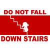
What is easier to read:
THIS
~or~
THIS?
That is the principle at work here. Glance at the screen for a quarter second. Can you even read what the cyan writing says? I couldn't.
I don't know what more to say. I hope this helps.
-
ManofTheAtom
- Deathmate was cool
- Posts: 13456
- Joined: Wed Feb 04, 2004 5:19 pm
- Location: Mexico City
- Contact:
That's the thing.
We're talking about shirts that people will be looking at for MORE than a 1/3 of a second.
The lines at the con are MASSIVE (I doubt that in the 10 years since I was there that's changed), so anyone wearing a shirt will be stared at by everyone else of hours.
The point of the shirt is to produce a promo that people will be hard-pressed to miss.
I'm gonna wear one, so everywhere I got at the con people will see it.
They'll see it when I sit down for lunch.
They'll see it when I'm in line for a panel.
They'll see it when I walk down the halls.
They'll see it when I'm sitting down to read a comic.
There's no way people will be able to miss a shirt with clear, eye-catching text.
The image itself is the first thing people will notice, that's what's going to draw them in. Once they're within the shirt's radius they'll notice the massive text and read it.
As for the comparison, I'm not using bright unreadable colors. I'm using dark colors against a light background. How is that not easy to read?
-
ManofTheAtom
- Deathmate was cool
- Posts: 13456
- Joined: Wed Feb 04, 2004 5:19 pm
- Location: Mexico City
- Contact:
-
Chiclo

- I'm Chiclo. My strong Dongs paid off well.
- Posts: 22022
- Joined: Tue Oct 03, 2006 1:09 am
- Favorite character: Kris
- Location: Texas
- Contact:
1. Thanks for proving my point even further - the silk screening process will not provide as clear or sharp an image as a bitmap (bmp) either.ManofTheAtom wrote:I'm not using a JPEG/JPG for the shirt, I'm using a higher resolution BMP in which the text doesn't look as blurry.Chiclo wrote:I don't really think surface area will be much of an issue. Kind of like getting these t-shirts in size small, not much to worry about there.
Evil Greg raises a good point, though. T-Shirt printing does not produce nearly so sharp an image as making a jpeg. So, you'll have a sharp drop in clarity to begin with.
If the problem is the font then tell me which font you'd like me to use. I have almost a 1,000.
2. It's not so much the font, it's the effects that surround the font.
-
Chiclo
- I'm Chiclo. My strong Dongs paid off well.
- Posts: 22022
- Joined: Tue Oct 03, 2006 1:09 am
- Favorite character: Kris
- Location: Texas
- Contact:
Doc Solar, meet Man of the Atom.Dr. Solar wrote:Have you ever looked at some dude in a death metal shirt were the band name looks like it is written in splattered blood and is pretty much unreadable? I have. Many time. No matter how cool the picture of the viking with the giant axe fighting the demon on top of the glacier is, I say "SQUEE it. I don't care enough to figure out what band that is".ManofTheAtom wrote:Simple = Bland.
The promo should capture people's attention.
That is what the writing is like with all the shadows, non-black coloring, etc.
Simple = effective = sales = more new VALIANT comics.
Yes it may be bland, but do you want exciting shirt with funky effects that you like and NO VALIANT books in the future, or do you want a bland shirt and MANY more VALIANT books to read in the future?
Any shirt made for marketing and advertising purposes should follow sound marketing and advertising principles.
The answer might not be as obvious as you think.
-
ManofTheAtom
- Deathmate was cool
- Posts: 13456
- Joined: Wed Feb 04, 2004 5:19 pm
- Location: Mexico City
- Contact:
They make their shirts using a laser printer. Is that the same as silk screening?Chiclo wrote:1. Thanks for proving my point even further - the silk screening process will not provide as clear or sharp an image as a bitmap (bmp) either.
2. It's not so much the font, it's the effects that surround the font.
-
Chiclo
- I'm Chiclo. My strong Dongs paid off well.
- Posts: 22022
- Joined: Tue Oct 03, 2006 1:09 am
- Favorite character: Kris
- Location: Texas
- Contact:
It's not the process, it's the medium.ManofTheAtom wrote:They make their shirts using a laser printer. Is that the same as silk screening?Chiclo wrote:1. Thanks for proving my point even further - the silk screening process will not provide as clear or sharp an image as a bitmap (bmp) either.
2. It's not so much the font, it's the effects that surround the font.
Pictures don't translate well - no matter the printing process - to cotton.
The laser printer will produce a clearer image than silk screening, but it will still not translate a busy image well.
-
Dr. Solar
- Spanked like a 4 year old in K-Mart.
- Posts: 10898
- Joined: Sat May 15, 2004 8:09 pm
- Favorite character: Sven
- Favorite title: Psi-Lords #2
- Location: Los Angeles Surviving Sectors
Have I met my doppelganger?Chiclo wrote:Doc Solar, meet Man of the Atom.Dr. Solar wrote:
[snip]
Yes it may be bland, but do you want exciting shirt with funky effects that you like and NO VALIANT books in the future, or do you want a bland shirt and MANY more VALIANT books to read in the future?
Any shirt made for marketing and advertising purposes should follow sound marketing and advertising principles.
The answer might not be as obvious as you think.
-
betterthanezra
- Wanna see an unpublished Shadowman page?
- Posts: 12346
- Joined: Mon Feb 09, 2004 12:18 am
- Valiant fan since: 1991
- Favorite writer: Josh Dysart
- Location: Scoot over, I have to get in behind you.
-
betterthanezra
- Wanna see an unpublished Shadowman page?
- Posts: 12346
- Joined: Mon Feb 09, 2004 12:18 am
- Valiant fan since: 1991
- Favorite writer: Josh Dysart
- Location: Scoot over, I have to get in behind you.
Since I am getting the shirts made (like I did 2 years ago) I don't have a super deep pocket book but I'm hoping to make 50 shirts for SDCC with the idea that leftovers will be made avalible to the board like they were before.Zero wrote:I won't be lucky enough to be at that show, but I'd love to get a shirt from you if at all possible.betterthanezra wrote:Did you guys NOT hear me...I will have SDCC Valiant Harbinger shirts made for the show.....
It will be cool....
Trust me...
-Brian
-Brian

-
whovianone
- ...it hurts so much ...my brain hurts!
- Posts: 3240
- Joined: Fri Feb 02, 2007 10:15 am
- Location: Kettering, OH
betterthanezra wrote:Since I am getting the shirts made (like I did 2 years ago) I don't have a super deep pocket book but I'm hoping to make 50 shirts for SDCC with the idea that leftovers will be made avalible to the board like they were before.Zero wrote:I won't be lucky enough to be at that show, but I'd love to get a shirt from you if at all possible.betterthanezra wrote:Did you guys NOT hear me...I will have SDCC Valiant Harbinger shirts made for the show.....
It will be cool....
Trust me...
-Brian
Dude, you rawk. Put me down for one. Finances don't allow for a flight. But, they do for a shirt!
-
ManofTheAtom
- Deathmate was cool
- Posts: 13456
- Joined: Wed Feb 04, 2004 5:19 pm
- Location: Mexico City
- Contact:
-
ManofTheAtom
- Deathmate was cool
- Posts: 13456
- Joined: Wed Feb 04, 2004 5:19 pm
- Location: Mexico City
- Contact:
You're the Silver Age version and I'm the Heroic Age version.Dr. Solar wrote:Have I met my doppelganger?Chiclo wrote:Doc Solar, meet Man of the Atom.Dr. Solar wrote:
[snip]
Yes it may be bland, but do you want exciting shirt with funky effects that you like and NO VALIANT books in the future, or do you want a bland shirt and MANY more VALIANT books to read in the future?
Any shirt made for marketing and advertising purposes should follow sound marketing and advertising principles.
The answer might not be as obvious as you think.